When it comes to crafting your film, the term ‘color palette’ encompasses many elements. From the cinematography to production design to costume design, the actual visual look of the film relies heavily on the color. Of course, this can be shunned away or not taken full advantage of. On the other end of the spectrum, it can evoke and strengthen the emotional impact of your film. Therefore, here are 10 films that use color to express a particular feeling.
1. Songs from the Second Floor (2000) – Detachment
Roy Andersson paints with the same colors in his static, larger encompassing mise-en-scene films and it all started here. From the drab grey, muted primaries and bleak desaturation, the film’s colors express a detached outlook on life that suits all the characters feelings and motivations.
Throughout the vignette-style film with an Altman-like cast, these people come and go around Sweden trying to communicate and make a real connection. The scenes add up into a narrative but the characters can never really speak the truth to one another. Therefore, Andersson’s use of drab and bleak colors evokes how the characters are feeling and we are right in the middle of it. Utilizing three cinematographers and a precise eye on the people, Andersson arrived back on the film scene and has been using these colors ever since.
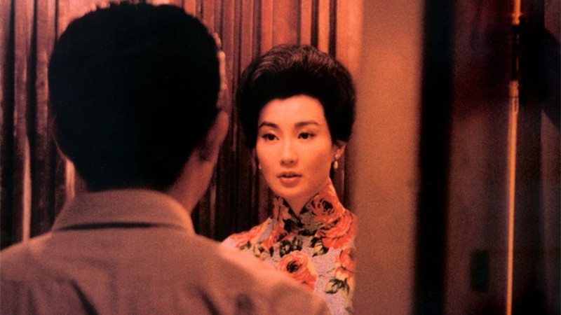
2. In the Mood for Love (2000) – Passion
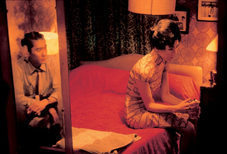
Shot over a lengthy 18-month period with Christopher Doyle and Mark Lee Ping Bin, Wong Kar-wai made sure every color filled with smoke, neon lushness, and rain made him feel the need for love. Of course, one can be referring to the apartment yellows and green plants, but it’s the red of the drapes, jackets, rugs, bed sheets and so much more that makes this film bleed with passion.
Hence the title and its brilliant coupling, or lack thereof, with Maggie Cheung and Tony Leung. With the entirety of the loneliness in the midst of a crowded Hong Kong apartment, the isolation in the city, or the polite gestures on a stairway, the audience sees these reds that make us in the mood for love, much like its two lead characters. Every frame is so precisely balanced, nuanced, and designed with the appropriate amount of colors that its central theme comes across in each image. The film truly shows how a color can express the central question and theme of a film.
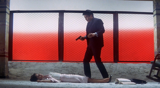
3. Suspiria (1977) – Fear
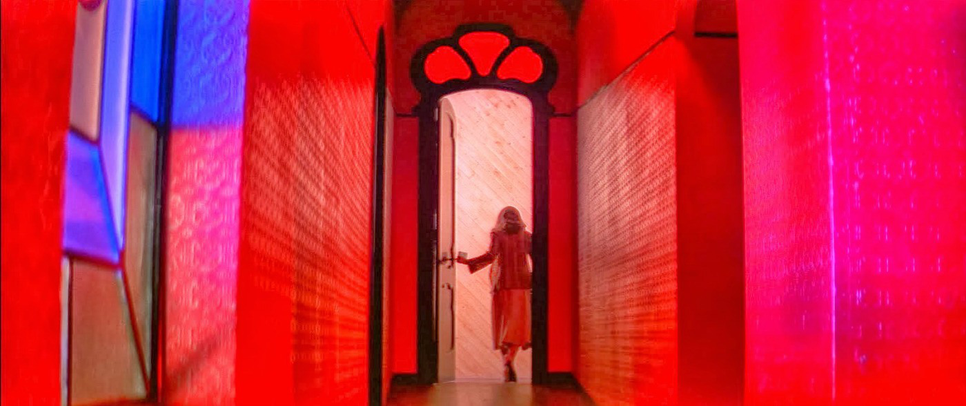
How can one use color to express fear? Well, when it comes to Italian giallo maestro Dario Argento, he uses every color to its fullest extent to express fear in the mind and eyes of the audience. From red shadowy drapes, freakish soaked blues, and neon-lite fake turkeys, his overabundance of colors shot by Luciano Tovoli expresses a particular kind of fear.
From the opening operatic murder scene drenched in red walls and lighting, any pair of eyes can tell this film won’t play by the rules. It’s through the colors and the particular shades of red that we see Jessica Harper’s Suzy descend into the harsh reality that her ballet school is really a front for witches. Filled with numerous set pieces all utilizing some form of red expressing a fear of death, murder, satanic cult, and paranoia, no stone is unturned when expressing fear.
It’s a film that makes its own rules and a color palette that one can never unsee. And through the brilliant direction of Argento, these colors morph the audience in a fear of the unknown for repeated viewings.
4. The Fall (2006) – Wonder
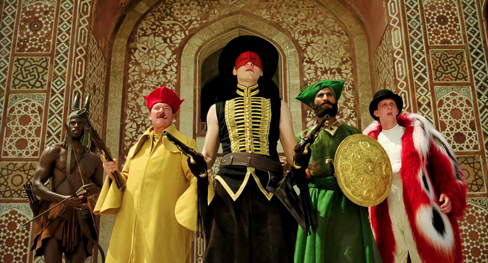
A film shot in over 20 countries will surely be diverse, exotic, and strange enough to see it. In Tarsem Singh’s mystical adventure fantasy of an injured stuntman telling a story to a broken-armed young girl in 1915 Los Angeles, it’s her vivid imagination that makes the story what it is and certainly with the colors of the world.
To pick a specific frame or color would be too much, but lensed by Colin Watkinson, the film’s design and color sparks pure wonder from the ancient to folklore to fantasy to medieval and everything in between. All of the landscapes of the world are shown in the film in a sometimes darkened, textured tone or cloud covered desert – nothing is off the table.
It’s certainly a film of almost documentary-like proportions; not in execution, but in each visual setting and film that encompasses the colors to enhance and spark our own imagination. Not just because of the story, but as the story is told to us as well, we create our own interpretation of these strange lands, increasing our own wonder of the world.
5. Tokyo Drifter (1967) – Frenzy
What is essentially a yakuza film with all the gangster tropes, Seijun Suzuki’s acidic, color-shifting, minimalist excessive art makes it truly standout. Whether our main character Phoenix Tetsu is battling it out in black and white, a white blizzard, or a color-shifting jazz club drenched in an original white, its unpredictable, uncontrolled excitement for color style makes us feel the wild behavior in this film.
Suzuki was always experimenting in style and through Shigeyoshi Mine’s photography, we never know what to expect. For example, the white club room ranges from yellow to red to purple all expresses what is happening in the minds of these anti-heroes and criminals. And sometimes simply because it looks cool. Regardless, it makes the film have this kinetic energy and exciting playfulness to it. When the film is rapidly over in its 83 minutes of runtime, you have literally witnessed almost every color in a deliberate way that you are not completely sure how to comprehend, leading to a moment of frenzied reflection.