6. Volver (2006) – Acceptance
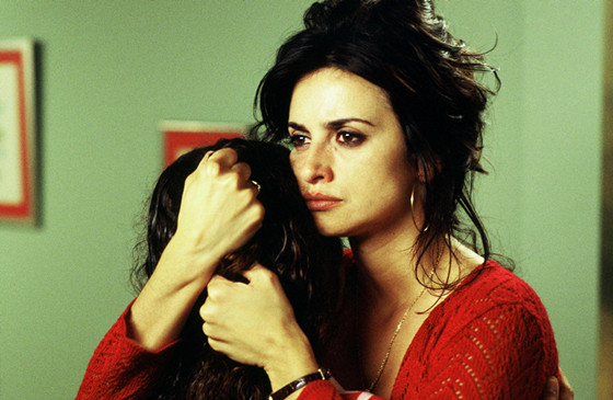
When it comes to the world of Almodovar, you know you’re getting a delicious, sexy aesthetic of colors thanks to production design Anton Gomez and cinematography, here by Jose Luis Alcaine. As the film is told in melodramatic fashion with a wide variety of genres to include tragedy, magical realism, and farce, the colors express all those ranges.
Almodovar creates his own worlds and here, the colors of bursting red, baby blue, vibrant green, and all the primaries that creates an oily, watershed of colors that express birth, life, death, and all in between. The colors eventually blend into all the genres and tonal shifts in the film, leading to our own acceptance of the world Almodovar created like all of his films. It coincides with the characters accepting the past – mistakes, returns, lies, denial, and murder.
Through the use of colors, we are psychologically inspired and happily manipulated into feeling what the characters feel and more importantly are going through. Without a strong sense of color to express this accepting feeling, the film wouldn’t be as strong as it is.
7. Enter the Void (2009) – Death
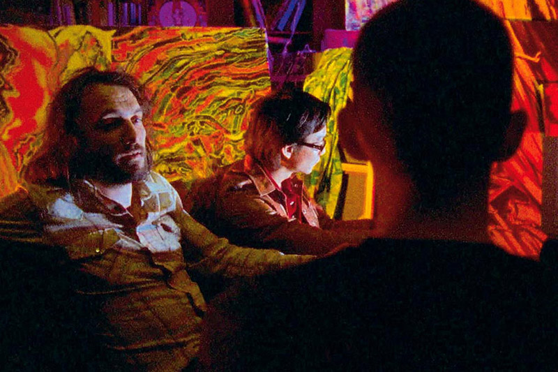
Leave it to Gaspar Noe and his go-to DP Benoit Debie to make a drug-fueled out-of-body experience that can only feel like death in Tokyo. From the exploration of DMT, The Tibetan Book of the Dead, and an actual death scene seen from the point of view of our lead and essentially the camera, the neon-soaked colors and use of black make it feel like death.
Using a motif of cut-to-blacks and flashbacks involving the death of their parents, Oscar and Linda’s journey, seen through Oscar’s eyes and floating spirit, with all the lights of Tokyo make it feel like one is passing into another dimension or realm. Putting the style, tone, music, and content of the film, the highly saturated neon colors of streets, toy stores, and miniatures in Tokyo and even the flourish softness of a day in the park make it feel otherworldly and something we haven’t experienced before. Could it be that we died and are in the afterlife? Coming back in a reincarnated form? There’s many interpretations but the use of highly stylized colors in a specific landscape makes it feel like a death trip.
8. Cries and Whispers (1972) – Suffering
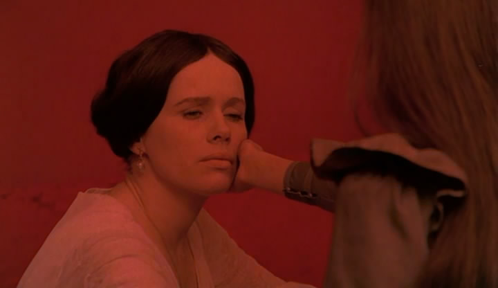
Ingmar Bergman famously stated, “All my films can be thought of in terms of black and white, except for Cries and Whispers.” Here he tells the story of two sisters and a housemaid dealing with the slow death of the eldest. Shot by regular Sven Nykvist, the use of red, white, and black make this film’s feeling of heavy burden of suffering that can exhaust any viewer in the best possible way by the end.
From the rooms drenched in red, the white bedroom gowns, and mourning black dresses, we feel a certain decay or uncomfortable presence in the room much like the three sisters. And more importantly, all the buried and deep recess of emotions that come pouring out in the final days before death approaches makes everyone suffer.
Despite being a beautiful and heart-aching film to watch, we feel these suffering women at the core of the film thanks to the use of design, production, and photography. And even in a particular climax of the film, we literally see the color shift before our eyes. It’s something of a magical feat even if in the highest form of despair, only Bergman with Nykvist could achieve such a feat.
9. The Umbrellas of Cherbourg (1964) – Melancholic Joy
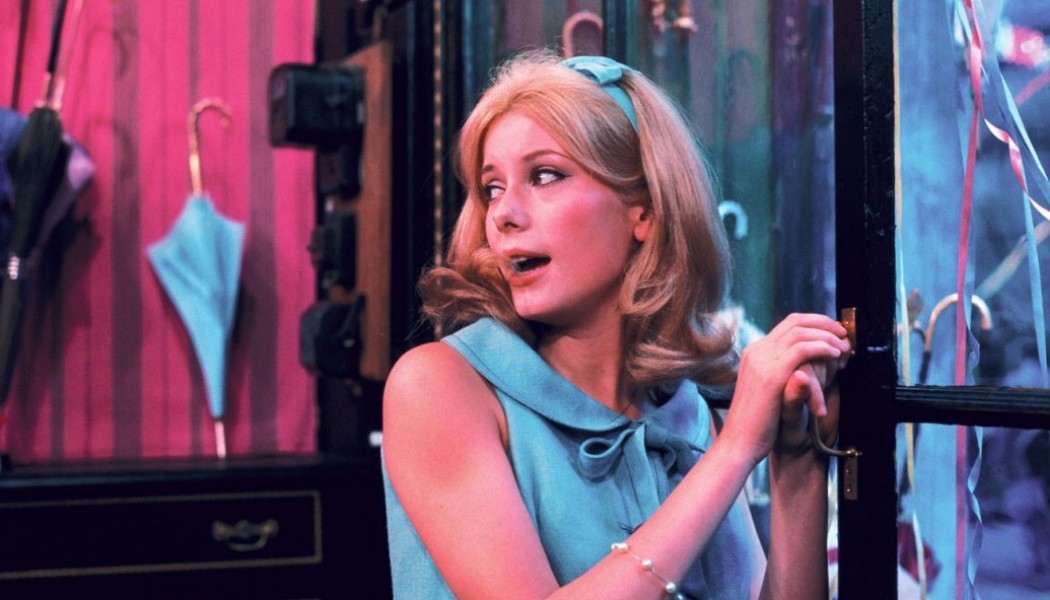
With a painterly designed world and characters, it’s hard to resist the charm of Jacques Demy’s groundbreaking all-singing musical, but as the film progresses, those colors sneak up on us.
As the film progresses and Catherine Deneue is tested as her lover is away, the once bright joyful colors of purple, pink, and yellow suddenly start to fade until a drab grayness takes over the film in the epilogue-like closure. Demy knew exactly how his world should be with the accompaniment of Jean Rabier’s photography. It’s somehow the balance and shift of the colors that corresponds to the emotions of the characters.
In the end, the colors represent the joy of falling in love and all of the possibilities, and toward the end, we are faced with the realties reflected in the colors of the world. Those specifically painted sets and world make us feel full of joy and an underlying melancholy as the film concludes.
10. The Red Shoes (1948) – Obsession
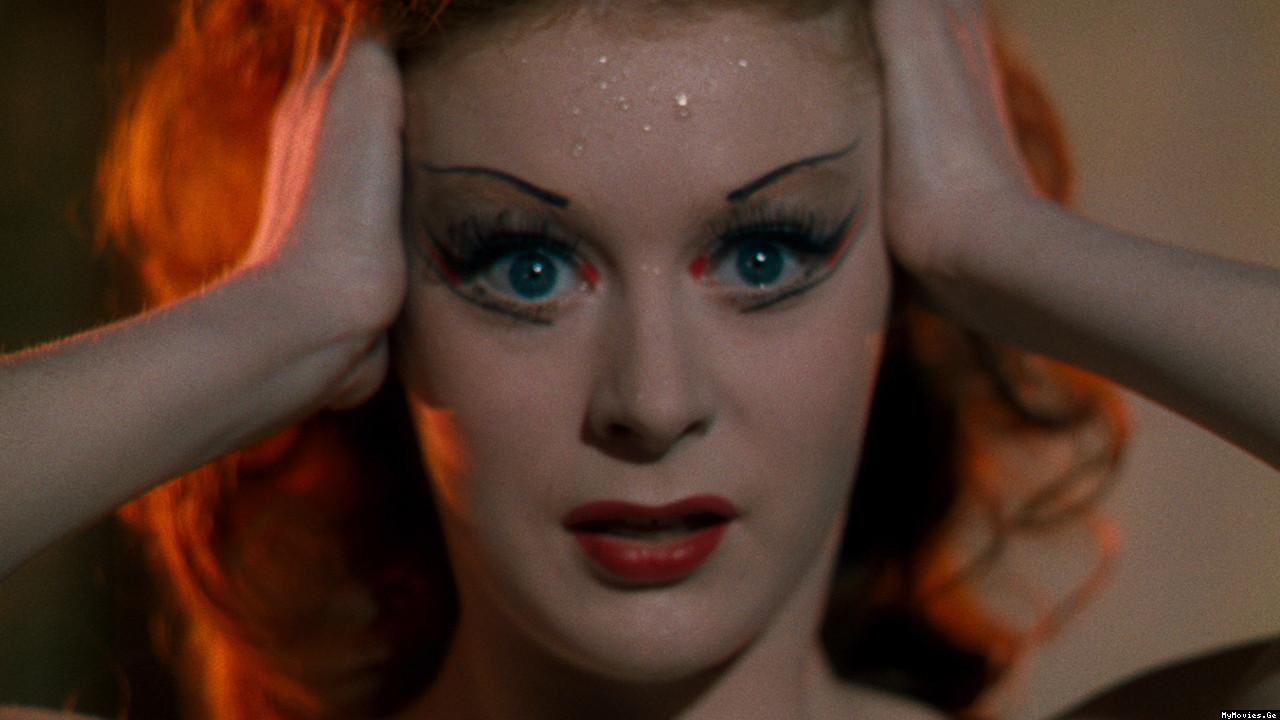
The very nature of the film and the actual ballet within the film deals with the obsession of a dancer for perfection. So it comes as no surprise that the Archers’ height of their power using Technicolor is when their colors are most affluent and precise.
The structure of the film can be dealt in the obsession of Moira Shearer’s obsession to perform the ballet ‘The Red Shoes’ resulting in expressive and vibrant colors. Then the actual ballet where the film turns into a dark fantasy-like fever dream. And then after Anton Walbrook’s romantic obsession over Shearer results in darkened interiors to almost devilish portions. The Archers created an operatic ballet of colors thanks to the brilliant photography by regular Jack Cardiff and production designer Arthur Lawson.
The film is simply one of the best films using Technicolor; no color, texture, shadow or light is ignored from the vast stage scenes to the vampire powdered face of Walbrook. For any cinephile obsessing over colors, look no further than this film.