When the era of black-and-white movies drew to a close in the 1930s and 1940s, filmmakers were confronted with an endless load of possibilities regarding the visual use of color. It didn’t take long for the directors to figure out the potential of color and its semantic capabilities.
The following list will present 10 directors who know or knew how to work with color, not just with a visual approach but a deeply layered meaning.
10. Jean-Luc Godard
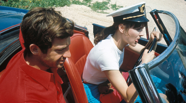
Contemporary cinema is mostly dominated by monochromatic, analogous or complementary color palettes. In particular, the use of shades of blue and orange has become something of a visual cliché nowadays (nonetheless, it has a huge cinematographic quality about it). However, the use of triadic color selections isn’t nearly as common as the aforesaid schemes. One of the first to make this look a trademark on his own was French director and trailblazer of the French New Wave Jean-Luc Godard.
His 1965 movie “Pierrot Le Fou” is a prime example of the triadic use of color and the proof for its aesthetic and semantic value. Though his movies always follow a political approach (sometimes in a very subtle way), his extended use of blue, white and red serves this theme, regarding the fact that these three colors in combination equal the French flag.
What’s also interesting about Godard’s color use is how he manages it to separate the attributes of the narrative from the surroundings. His walls are beige, his streets are gray and his sky is damp. It’s his protagonists and their props that breathe life into the scenery – always underlined by some saturated shades of color.
9. Akira Kurosawa
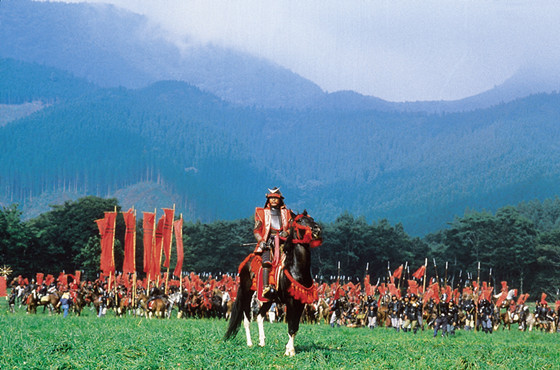
Until 1965, Japanese director Akira Kurosawa made 24 films in black-and-white with the only blur of color being a shade of pink in 1963’s “High And Low”. Although his most famous works were shot in black-and-white, Kurosawa used color in a very original and intelligent way for his last four movies. Taught as a painter, Kurosawa had quite a in-depth knowledge of color theory.
From the toxic-like colors in “Dodes’ka-Den”, symbolizing the depressing life in a slum, to the visual tension between yellow and red in “Ran”, his technicolor features go way beyond an arbitrary color selection. Kurosawa was well aware of the versatile possibilities of color in order to serve the story. He used it to separate characters (or even armies like in “Ran”) from each other or to establish ties between them.
8. Zhang Yimou
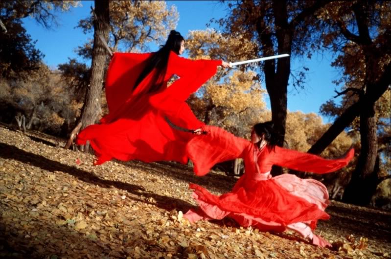
Zhang Yimou made a name for himself as one of the best Asian directors of contemporary cinema, and there’s no doubt he managed to develop a vey own aesthetic, especially when it comes to the use of color schemes.
As well as in the works of Pedro Almodóvar, Yimou’s color of choice is red. Most of his movies feature significant shades of red: The use of red lanterns as a symbol for power in “Raise The Red Lantern”, the protagonist’s red cloths in “Ju Dou” that represent the dangerous events which are about to come.
His hailed wuxia saga “Hero” is more versatile in regards of color. It is even separated in four parts, represented by four different colors. Red, green, blue and white nearly work as characters itself in the narrative and transport in-depth ideas of the story. What’s so rare about this film is the dogmatic monochromatic approach.
To put it in the words of Doyle: “The thing about color is that it’s like light. In order to see darkness on film, you need a bright spot in some part of the frame. In other words, you need a contrast.” However, the scenes in “Hero” are nearly always dominated by just one color and no contrasting part. It’s this experimental and brave approach what separates Yimou (and his team) from other filmmakers of his region.
7. Wong Kar-wai
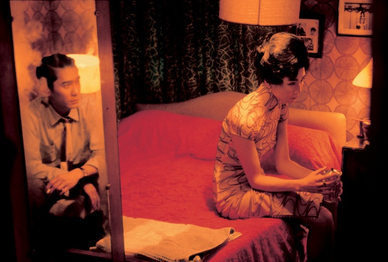
When discussing Wong Kar-wai’s work as a filmmaker, his outstanding ability to create an immersive atmosphere, pulling the audience into the movie’s world, is what immediately comes to mind. While some directors are known for a single color to be their dominating visual factor, Wong is a master of many colors. His films are like paintings in motion, works of a modern artist, who fades, blends and cuts between colors with poetic resonance and emotional precision.
His cinematography (Wong’s cinematographer Christopher Doyle created a very own visual aesthetic, being an influence for a whole generation of Asian filmmakers) is dominated by monochromatic color palettes and deeply contrasting tones, enhancing the visual and emotional effect of the commanding color. In his hands, color becomes a tool to create intimacy between the characters, the environment and the audience.
“In The Mood For Love” might be one of the most intimate movies of recent years. Aside from the touching narrative of two lovers, it’s especially the use of red shades that create a feeling of being inside the claustrophobic apartments of 1960s Hong Kong as well as the protagonists.
6. Pedro Almodóvar
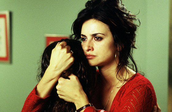
Besides giving the world of cinema some of the most well-created female characters, Spanish writer and director Pedro Almodóvar is known for is highly colorful movies. His mixture of pop art sets, postmodern design and baroque-influenced art build the perfect medium for his extended use of color.
For him, color has to serve the story and especially its characters. The objects around the protagonists define them in a subtle way and so do the colors. One doesn’t have to analyze the director’s whole oeuvre to see his fixation on complex characters and twisting plots. His multicolored aesthetic works as perfect visual counterpart.
In his movies, colors are metaphors for a distinct emotional state for the characters’ journeys. When the color is changing, Almodóvar often implies an equal change of emotion. The Spanish cult director is well aware of the color’s effect on the audience, making him a master of his craft.
There’s no doubt that red is his color of choice when it comes to the point of underlining the movie’s narrative. Often working as a symbol of passion and danger alike, red might be the most complex color in regards to semantic levels, not only in Almodóvar’s cinematic universe.