Back in the 1990’s there was a considerable cultural stir within the film community. Several companies, notably one owned by mogul Ted Turner, were indulging in a process called colorization. Simply put, this process took films created in black and white and added color to them (much as old post cards had once been colored). This was done in an effort to interest younger viewers in older films and thus make them more commercial. Many, many film buffs were appalled.
Most of those who spoke out against the process took the tack of exalting monochromatic photography, admittedly beautiful but considered by some to be somewhat passé in the modern film era. As part of this campaign, many of the colorization opponents condemned any use of color in film. Maybe a certain something did get lost when films went almost completely to color, but this argument was facile. The great, and wise, director-writer John Huston noted that color could be a great tool in the hands of a film maker who knew how to use it and what to do with it. And he should have known since he used color to great effect in many of his films.
What the anticolorization crowd missed was the fact that color in some form or another has existed almost has long as cinema itself. Indeed, the first color motion picture was released in 1912. The perfected three-strip Technicolor process didn’t arrive until 1935 but that still gave film makers many years in which to use it. The process was costly and thought to work best for musicals, comedies, big, spectacular films such as Gone with The Wind or special projects such as the animated films of Walt Disney.
However, after World War II, a more modern wave of thought started to creep into world cinema. Many noted directors started to use color as another means by which to effectively tell stories as part of their visual styles. Like the use of black and white, this was a creative decision—and that was what colorization was infringing upon.
Below are a number of outstanding examples of how skillful film makers can use color to superb effect.
1. The Red Shoes (1948)
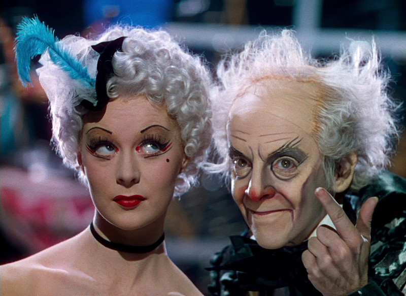
One of the great delights of world cinema, certainly vintage British cinema, is the oeuvre of the filmmakers known as The Archers: Michael Powell and Emeric Pressburger. Though they were secretive about who actually did what on their films, history has revealed Powell as director and Pressburger as screenwriter. Whatever the division, they produced a number of stunningly original films, each very different from the others. This team always loved using color (Powell’s first effort of real note was as one of the directors of the lavish and beloved color fantasy The Thief of Bagdad in 1940).
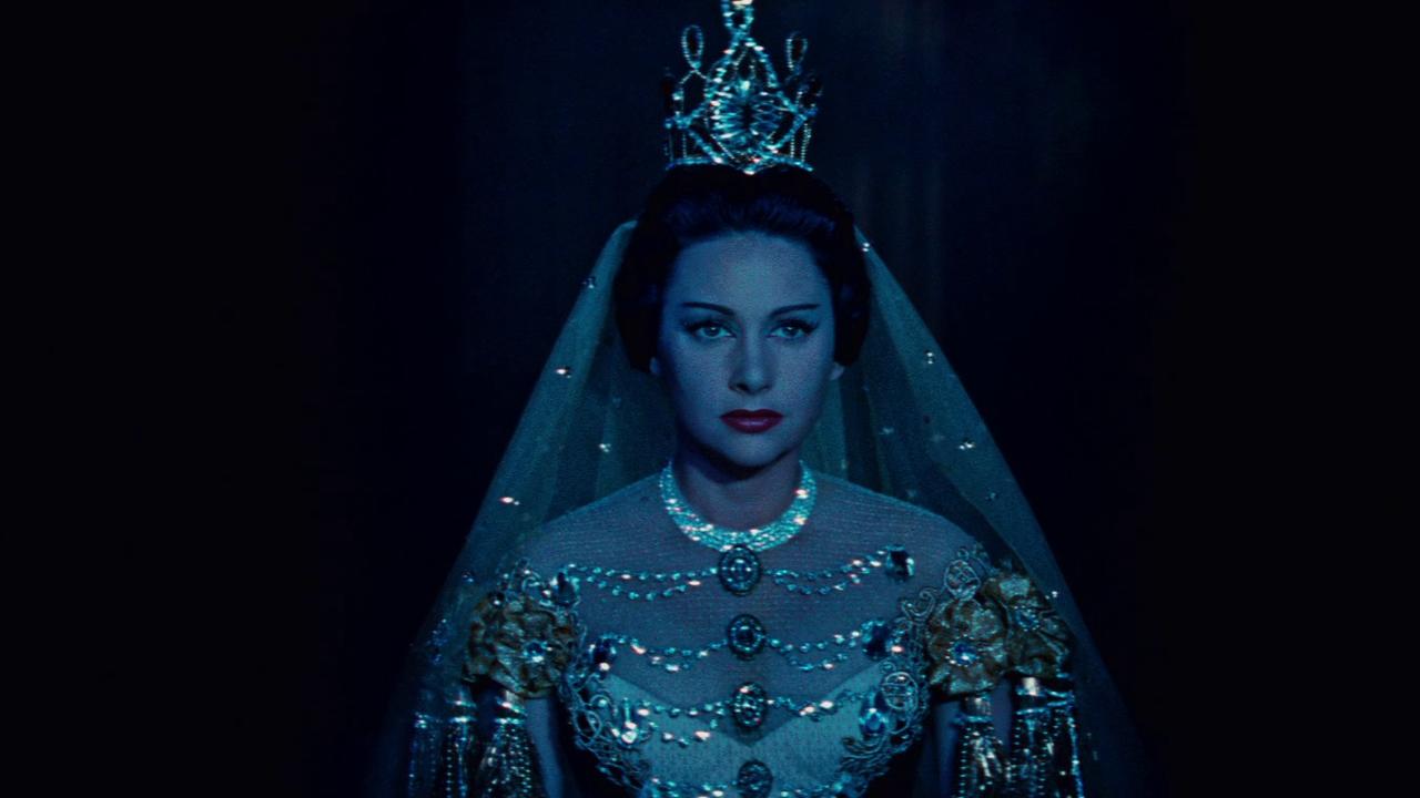
In 1943 they had gone to much effort to have their large-scale wartime drama, The Life and Death of Colonel Blimp, produced in color—and it was worth it. However, their finest hour both in the use of color was The Red Shoes. Never has a great film been built on a plainer story: a young ballerina is torn between her love of a young composer and her love of dance, personified by a demanding impresario who insists that dancers can have no personal life.
The notoriously difficult Technicolor consultant Natalie Kalmus proclaimed the film the best use of the color process. That is debatable but the deep and passionate color palette creates a wonderful fairy tale ambience as the screen, awash in multiple hues (especially during the long ballet sequence in the middle of the film) invites the viewer into a precious, rarefied world that seems beyond the reach of ordinary people and which makes what might have been an ordinary and negligible story into a magical experience.
2. The River (1951)
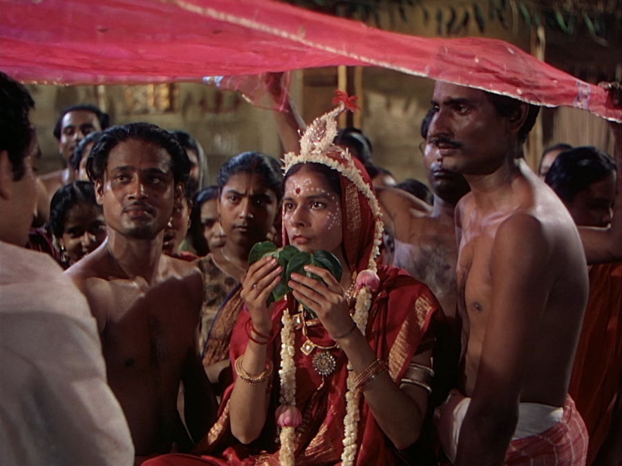
For an artist as great as French director Jean Renoir was from virtually the beginning to the end of his career, he certainly had a rough time of it. After a decade that can only be termed “platinum” in his native France during the 1930s, political events caused him to flee Europe. He landed in Hollywood and loved it but it didn’t love him back. He washed out of U.S. filmmaking in the late 1940s and his homeland was initially a bit chilly about welcoming back someone who had run away in times of trouble.
He spent several years “at liberty” until an independent British film company had the sense to hire him to create a version of author Rumer Godden’s India-set novel, “The River.” This would be the director’s first color film. The son of the great Post Impressionist painter Auguste Renoir would prove to be a master of color, using it in a delicate, subtle manner that commented on characters and locations and their interactions.
In this film, the British colonials are pictured in soft muted colors, the locals in bolder ones and the film’s real star, the landscape of India, in the most vibrant hues of all, commenting on the country’s dominance over all who dwell upon its earth.
3. Gate of Hell (1953)
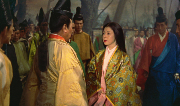
Film students and any who care anything about film can only be glad that the art of film restoration, and the desire to restore, is at its present high level. When PBS showed Gate of Hell in the 1970s, the host commented sadly on how the film’s famous color had faded with the years. This was tragic since the film was an Oscar winner for both best foreign film and best costume design, in addition to being considered one of the great color films of world cinema. Happily, 2011 saw an elaborate digital restoration for this drama of illicit passion, deceit, obsession and violence set in feudal Japan.
The film opens with hands taking a scroll from an elaborate box. The scroll, illustrated in lush and lavish detail, tells the ancient story of the film and as the camera pans across it, the scroll comes to life in exquisite detail. Though the drama is involving, the colors all but hypnotize the viewer with their vivid beauty. Asian cinema would go on to a tradition of excellent color usage and this might well be the starting point of that tradition.
Oddly, director Teinosuke Kinugasa would not go on to a great international career since few of his films would be exported but those who have seen his other pictures have noted that his sense of color was consistent with this masterpiece.
4. Lola Montes (1954)
Much like Jean Renoir, Austrian-born Max Ophuls was a great director with rotten luck. After a string of notable films the Jewish Ophuls had to escape when the Nazis invaded his country. Like many other expatriot filmmakers, he went to Hollywood. There he made four mostly fine films but none were great hits at the time. However, upon returning to Europe he turned out three masterpieces—and they made money, too!
This set the stage for a group of financial high rollers to hire him for a big budget affair they were planning based upon a novel. It was a fictionalized version of the life of the infamous 19th century courtesan, Lola Montes, companion to royals and great artists and many of lesser standing. This would be Ophuls’ first film (and, as it turned out, last) in both color and wide-screen. It would also be, as it happened, his biggest flop with both the public and critics. It helped to hasten his decline and death and he never made another film.
The financier-owners, desperate to retrieve their investment, also mercilessly cut, re-edited and rearranged the picture many times over the years. Thankfully, cooler and more caring heads eventually rescued the film and in 2008 it was lovingly restored to its full grandeur and complex original structure. In the interim, many have commented on Ophuls’ amazing use of wide screen.
The fact that he was able to make only one film in that process is a tragedy. However, restoration has shown that he was equally gifted in the use of color. Pretty? Yes, it’s a pretty period piece but it is also the tale of a woman whose outer beauty and the baroque life that her beauty brought her was also a story of unfortunate consequences.
The colors tell Lola’s story and comment on her emotional state. The end, where she exists as central attraction in a tacky circus, is awash in garish shades that impart a cheap glamour. The darker, elegiac colors of the past are the tones of memory, bolder than they were at the time and comment on how it all slipped away from her. That Ophuls never got to work in color again is another tragedy.
5. Written on The Wind (1957)
Often considered cinema’s supreme ironist, German-born Douglas Sirk, came of age in the German theatrical tradition that decreed that every element in a dramatic entity must contribute to the overall feel, texture and tone of the work in order to create a dramatic unity (in film this is known as mise-en-scene). The last part of his career was both the most financially successful and most highly regarded by film historians.
The real irony is that the director hated what he thought were trashy scripts enacted by limited performers. His manipulation of the projects show an artist constantly at odds with the material with which he was working, making pointed commentary on the themes of the pictures via his use of camera placement, architecture, props, and, in many films, color.
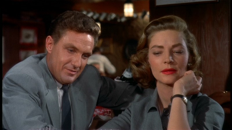
Written on The Wind, one of his rare films with exploitation producer Albert, is one of his most scintillating, driving films. This tale of sensible people caught up in a web of circumstances involving a decadent, going-to-seed brother and sister, the last remnants of an oil- rich Texas family, showed where Sirk’s sympathies lay in his color choices.
While the film pays lip service to the nominal hero and heroine, they are pictured constantly in earth tones, greens, browns and other dull colors, while the troubled sibling duo is allied with electric shades of red, yellow, pink, blue which easily dominate the surroundings, depicted in the autumnal colors of nature that provides a setting for the story, and the film that contains them.
6. Vertigo (1958)
Alfred Hitchcock was British by birth and shouldn’t have had any extensive similarities with German Sirk. However, he had apprenticed extensively in Germany and, though he would have been the last to admit to so much deep thought in relation to his films, he was just as much in control of the “plastic” elements of his pictures as any director in film history. Hitchcock did not use color until Rope in 1948 and would alternate color and black and white films until after the monochromatic Psycho in 1960.
Thus, any film made in color during that almost decade and a half demonstrates a definite purpose in regard to its visual technique. Hitchcock and his team of top professionals knew well how to visually create the mood he wished to convey. Almost any color Hitchcock film could illustrate this but no Hitchcock film has seen its stock rise as dramatically as Vertigo.
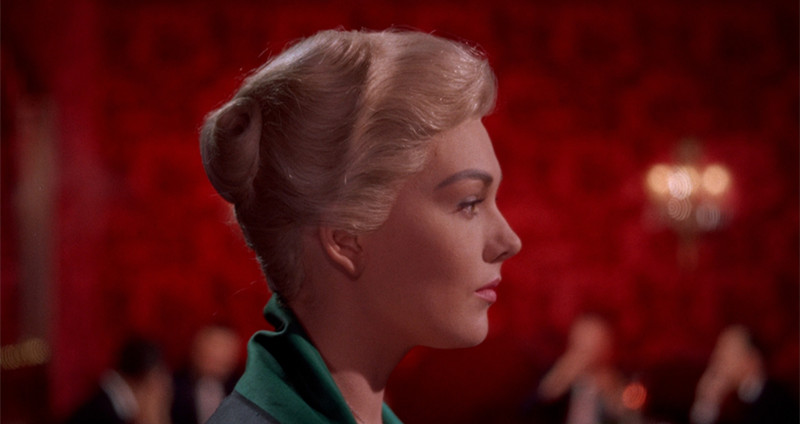
Like so many great films it was a flop in its own day, a masterpiece by today’s standards. In 2012, it was rated the greatest film of all in Sight and Sound magazine’s once-in-a-decade poll. Be that as it may, Vertigo is a breathtaking color film detailing a private detective’s strange involvement with an ethereal woman he is trailing and the even stranger aftermath of that relationship involving another woman, who has more of a relation to the first woman than may be suspected.
The film contains a brilliant red/green motif indicating danger and a vibrancy among the living that can turn into a ghostly remnant of life. Also, it’s notable that Madeline, the first woman, who is more a creature of spirit than flesh, is virtually colorless in her gray suits, black shoes and evening gown and pale blonde hair. The detective’s platonic girlfriend is seen in neutral colors that give off no strong impression while the second woman involved with the man is seen in green, purple and brown before allowing him to impose the past on her and leading her into a realm of colorlessness. Add to this the intense color schemes of the backgrounds and Vertigo becomes the dreamlike experience Hitchcock planned from the start.