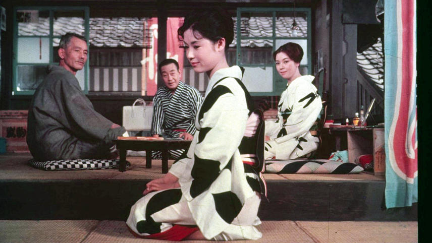
7. Floating Weeds (1959)
One of the profound delights of modern film study is the discovery/rediscovery of the majorly talented Japanese director Yasujiro Ozu. Ozu is often linked with France’s Robert Bresson and Denmark’s Carl Theodore Dreyer as filmmakers who explore darker, deeper, more intellectual areas of the human condition without commercial compromise, a path few in cinema history have followed. One big difference between Ozu and the other two men is his warmth and love of humanity.
Ozu films are also quiet, always still, always lacking in heroes or villains but filled with people who must make choices about their lives and relationships, almost always family relationships. He made many more films than the other two put together in a successful career that stretched from the 1920s until his premature death in 1963 at age 60.
Floating Weeds is a remake of his silent A Story of Floating Weeds. In the film an aging actor returns to a rather shabby seaside town in which he once played, significantly, years before. It seems that he fathered a son by a local woman and in the guise of an uncle sees the young man. The story was originally told in black and white but sound and color adds other elements to it.
The color emphasizes the drabness of the town, even against the beauty of nature, and contrasts it with the colorfulness of the actor’s travelling show. However, it’s a shallow kind of colorfulness, indicating that the show biz world the actor inhabits is about as glamorous as the posters that adorn the drab spaces where they hang. Ozu’s subtle use of the color also shows that the everyday life of the town and the son nonetheless contains a comforting element the actor has missed through his irresponsible actions of many years before.
8. Contempt (1963)
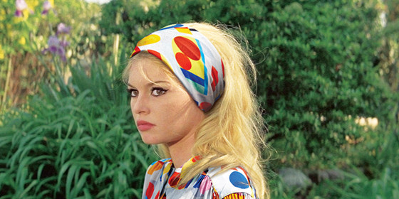
Like all the Nouvelle Vague critics who became directors, Jean Luc Goddard loved films past and present, albeit in a conflicted way. He often didn’t so much make films as anti-films, films that dissected genres and forms. After making a number of films that were close to being shot on a 8MM Bell & Howell hand-held camera, Goddard surprised everyone and worried the faithful by signing to do his first theatrical film in wide screen and color.
It was an adaptation of a very commercial novel starring France’s big box office sex symbol, Brigitte Bardot, and Hollywood star, Jack Palance. The worries were unfounded. The resulting film, Contempt, used every element to point out the emptiness of such big commercial undertakings and a profound emptiness among the shallow characters in the film. An exception is the main character, a writer who has sold out. He has nothing but contempt for himself and the blowhard producer to whom he sold out, as well as his own wife, who now has contempt for him and the producer (that’s a lot of contempt).
The film looks big and vacuous with colorful but oddly empty spaces bearing down on the writer, now the unproud processor of a big, glossy, colorfully empty life. Like so much with Goddard, the color here is used in a way that deconstructs the very idea of color.
9. The Red Desert (1964)
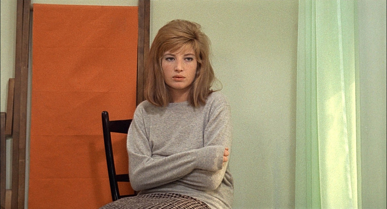
Michelangelo Antonioni had a long career in his native Italy but a short one as an international film maker. However, in the decade or so he was present on that scene, he made some memorable, sophisticated and very modern films. The elegant black and white photography of those films gave them a timeless feel: they really don’t date today.
Red Desert was his first color film and a much awaited one. Many were taken aback at how it looked but the director used color just as he wished and achieved just what he wanted. Another tale of spiritual aridity, the story concerns yet another of the director’s emotionally lost, anemic women—in this case, Monica Vitti. This woman is the victim of a recent nervous breakdown facilitated in large part by her husband, a man superficially caring but emotionally absent. Even her child is scant comfort. Visiting her husband at his worksite, a nightmare of machinery in a overly industrialized part of Italy, the landscape looks as forbidding and barren as the woman’s life feels. She makes tentative contact with a co-worker of her husband but the colorless settings around them promise very little.
Antonioni used color in a most sparing and careful way. The splashes of intense color in places such as the humble home of laborers and the deep colors in the illustrated story the woman tells to her child, drive home the plainness, the ugliness of the bleak modern landscape more effectively than black and white could ever achieve.
10. The Masque of The Red Death (1964)
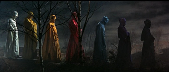
Half a world away from Italy and figurative worlds away from the kind of lofty film makers noted up until this entry, The Masque of The Red Death premiered the same year as Red Desert. It was the product of American International Studios, a wonderfully down to earth Hollywood company out to make a buck by giving decent enough entertainment to its teenage core audience. The studio’s producers, Sam Arkoff and James Nicholson along with Roger Corman, who was also a director, never, ever spent a dime unless they felt that it was warranted.
From the start of the 1960s onward A.I.P films were made in wide screen and color. Though A.I.P. would not be caught dead admitting to producing anything artistic, some of their films have an artistry of their own. Among the best of the studio’s films are a cycle of films ostensibly based on stories and poems by the great American writer Edgar Allan Poe. Among the most faithful, and among the best, is The Masque of The Red Death, a film often compared favorably to Bergman’s classic, The Seventh Seal.
Like that film, this story has gothic supernatural figures observing and stalking a decidedly flawed group of mortals in plague-ravaged 12th century Europe. Principally among these is the evil Prince Prospero (Vincent Price) and the entourage holed up in his vice-ridden castle. In order to enliven the small budget, Corman employs a number of flashy and effective color visuals, tones meant to evoke a feeling of fear and unease (single, deep hues wash over many scenes).
The climax of the film is also the high point of the color experiments as Death comes to claim his own, casting a haunting color pattern over the participants soon to pay their just dues. The intent may not have been high art but it was highly effective.
11. Don’t Look Now (1973)
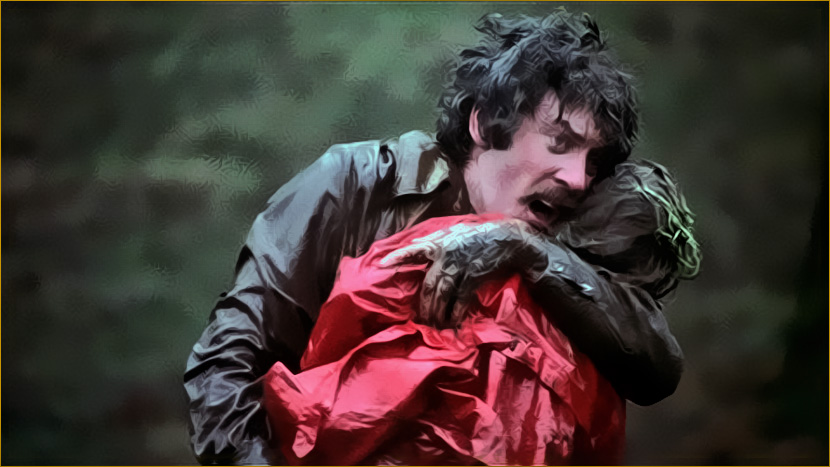
Nichols Roeg was a top cinematographer before he became a director. Looking at any of his films, it’s obvious that he thinks visually. He often explores themes of violence, power, eroticism and loss. One of his best is this early effort, taken from a Daphne du Maurier story in which an architectural restoration expert and his wife (Donald Sutherland and Julie Christie) use the job he has taken in Venice as a respite from a terrible personal tragedy. Venice is in the midst of winter.
Instead of a lush and sunny place its beauty is frozen and pale. Haunting this is a mysterious little figure in a bright red raincoat, something that has deep significance for the pair. If this story were told in a routine way it would be truly trite. However, the style here is arresting and a shot of a drop of water causing the red in a photographic slide to run ends up tying it all together. The clammy feeling the colors convey, punctuated by slashes of more vivid color, sets the viewer up for a mighty wallop at the climax, a triumph of style.
12. Mishima: A Life in Four Chapters (1985)
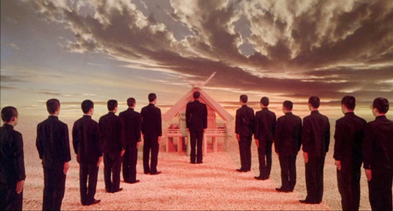
By most accounts, acclaimed Japanese author Yukio Mishima was a troubled and troublesome man. By many accounts screenwriter-turned-director Paul Schrader is pretty troubled. Though their countries of origin are quite different, Schrader was sure that he understood Mishima, who was long dead by the time this film was made.
Set on the last day of the author’s life, it is filmed in very low key and deliberately washed out colors. The flashbacks to Mishima’s youth are shot in velvety black and white. There are four fictionalized episodes, taken from Mishima’s novels but projecting the author into them. The episodes are all in vibrant color, as benefits the one realm where Mishima felt himself to be the most alive: his fiction. E
ach episode, as different as was each novel, is quite different in color style and palette. Is this indeed Mishima’s story? No one can truly know, but the attempt to find him via reasonably selected fiction and the emotional state created in his own mind is fascinating. Using colors to help create an emotional state to explain a complex, mysterious character is a brilliant idea. The idea of mixing visual styles as approaches to telling a complicated story would gain acceptance years later, notably in the work of Schrader’s spiritual descendant, Oliver Stone, but Mishima got there first.
13. The Last Emperor (1987)
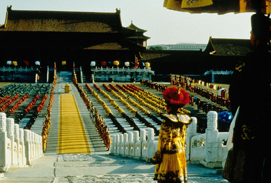
The renowned Italian director Bernardo Bertolucci, a dedicated Marxist, here tells the story of China’s last imperial ruler, Pu Yi, an ineffectual and miserable monarch but eventually a pretty good gardener. In order to properly tell this story, the director creates a visually sumptuous world in the first part of the film. The stunning sights, highlighted by sensual and evocative color cinematography by Vittorio Storaro emphasize the glitzy opulence and empty, mindless dedication to meaningless ceremony involving masses of people amid stunning architectural designs in the famed forbidden city.
All of the beauty, in the face of a starving and poverty stricken populace, centers around a man who just happens to have been given a title. The second part of the film sees the color drain away as China and Pu Yi start to face life on a more practical level. What at first looked to be an exercise in visual style instead drives the point home that beautiful glitter is a poor excuse for subsuming human rights. Truthfully, though, the magnificent sights of the first half linger in the mind.