Film is an art form which combines many various disciplines and a good film is not necessarily a film that looks good. But there is no denying that film is first and foremost a visual medium and that making your movies look beautiful can never really be a bad thing.
Below you will find twenty directors who all have made various visually beautiful pieces of work. Some of them have very distinct visual styles, whereas others seem to vary the look of their movies significantly whilst still always keeping them visually impressive. And some of these movies are masterpieces, whilst others are a whole lot less successful. But the one thing they all have in common is that all of them have graced the screen with some awe-inspiring imagery.
20. Danny Boyle
Most noteworthy examples: The Beach, Sunshine & Slumdog Millionaire
Whilst Boyle’s earlier works, Shallow Grave and Trainspotting, are without a doubt better films with their fair share of stylish camerawork, it wasn’t until later in his career that his movies started to have a truly noteworthy visual look.
The Beach was shot by Darius Khondji, a cinematographer who will be featured more on this list, and was bathed in lush colour and a kinetic visual style. Slumdog Millionaire was equally visually arresting and shot by Anthony Dod Mantle, who would again collaborate with Boyle and also make 127 Hours look quite spectacular, despite the fact that it was mostly set in one location.
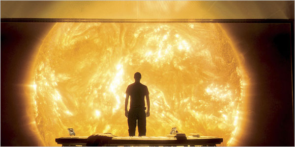
But perhaps Boyle’s greatest looking film was the SF thriller Sunshine. A thoroughly frustrating film, which has a sublime first two acts but a third act in which the story falls apart, it can not be argued that it is one of the most spectacular and stylish looking SF films ever shot. Cinematography, special effects and production design combine to create something truly unique here. If only Boyle could combine the story telling and freshness of his earlier works with the look of his later films, we might be in for something truly special one day.
19. Pedro Almodóvar
Most noteworthy examples: Women on the Verge of a Nervous Breakdown, Talk To Her & The Skin I Live In
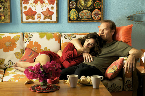
If there is one word to describe Almodóvar’s films, it would simply have to be colourful. His campy pop-art aesthetic was already present in his earlier works but really came to the forefront in his international breakthrough film, Women on the Verge of a Nervous Breakdown. A film so colourful, it could easily be mistaken for a Mondriaan painting, had the man not just painted geometric shapes and been a gay Spanish surrealist.
Together with his partner in crime, cinematographer José Luis Alcaine, his frequent collaborator on other highly colourful movies such as Tie Me Up! Tie Me Down! and the other noteworthy example mentioned above, The Skin I Live In, the duo manage to make the colours leap of the screen and burn themselves into your retinas, greatly augmenting the surreal sensibilities of Almodóvar’s work.
But it’s not just Almodovar’s colours, which make him a extremely talented visual director. His striking imagery also clearly stands out. A fine example of this is the silent film parody and surrealist fantasy sequence in which a man climbs into a woman’s vagina in Talk To Her, one of Almodóvar’s best. No wonder he has been compared to the late great surrealist master Luis Buñuel. Imagery doesn’t get much more outlandish than this.
18. Guillermo Del Toro
Most noteworthy examples: Blade II, Hellboy I and II & Pan’s Labyrinth
Guillermo Del Toro’s knack for impressive visual imagery was there from the very start. His early Spanish features, Cronos and The Devil’s Backbone, both already showcased his talent to fill the frame with remarkable imagery but it wasn’t until he went to the States and his budgets and stature grew that we got to see what the man was really capable of.
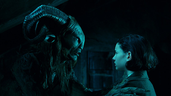
His comic book adaptations, Blade II and both Hellboy movies, show a clear understanding their of source material and managed to impress with the fantastic production design and clear use of colour and light but his crowning achievement has been the Spanish produced Pan’s Labyrinth which took things even further. The haunting creepy adult fairytale has become a benchmark against which films of this type are measured and its nightmarish and fantastical imagery exists almost in a sphere of its own.
His go-to cinematographer has been Guillermo Navarro, who has shot all his films since The Devil’s Backbone, with the exception of Blade II. Del Toro’s passion for wondrous visuals has also carried over to the many films he has produced and it isn’t surprising that he was initially hired to direct Peter Jackson’s Hobbit Trilogy before having to bow out due to scheduling issues. It would have been so interesting to see the results there had he stayed on board.
17. Andy & Lana Wachowski
Most noteworthy examples: The Matrix Trilogy, Speed Racer & Cloud Atlas
Whilst the overall quality of the Matrix Trilogy is questionable (we all know the first one was incredible whilst the sequels were pretty hard to stomach), the visual style of all three movies certainly is not. Groundbreaking use of special effects might have been the key here (who can ever forget bullet time effects?) but the films green-tinted colour palette and original production design completed the package and sealed the deal.
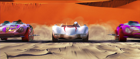
The Wachowskis followed up their success with Speed Racer, a truly god-awful film, which nonetheless was a visual spectacle of the first order, provided you could sit through the vomit inducing hyper-kinetic and over-the-top candy-coloured whirlwind of images. The movie might have been a disaster on many levels but you sure as hell had never seen anything like it without the aid of drugs.
Toning things a bit, Cloud Atlas turned out the be yet another ambitious but flawed project although it once again offered cutting-edge special effects and visual delight. The Wachowskis are currently working on their next SF opus, Jupiter Ascending, which from the looks of trailer will at the very least be continuing their impressive visual track record.
16. Dario Argento
Most noteworthy examples: Deep Red, Suspiria & Inferno
Dario Argento is the master of the genre known as Giallo, the Italian word for the colour yellow. It comes as no surprise then that his Giallo horror films are extremely colourful (actually, the two have nothing to do with each other as the term Giallo simply referred to the colour of the trademark yellow paperback covers of mystery novels, which inspired the both genre’s name and subject matter).
Nonetheless, Argento’s films are a sight to behold. He had already directed his “Animal Trilogy” in the early seventies, which were all highly stylised pieces of work but it wasn’t until he came back from a few years hiatus from the Giallo genre that his most audacious work was delivered in the form of Deep Red, still often cited as the best Giallo film ever made. It had a tremendous impact on horror films and especially slasher movies, although none of them would ever look this colourful again.
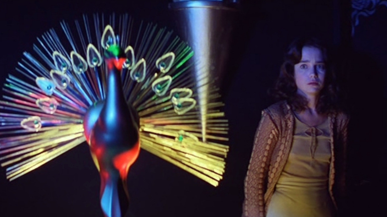
He followed up Deep Red with Suspiria, where incredibly enough he managed to turn the colour volume up even higher. A true assault on the retinas, Suspiria is maybe better described as a surreal work of nightmarish imagery than a horror film. It’s just that outlandishly visual. After Suspiria came Inferno, a semi-sequel to Suspiria. Although never reaching the heights of his two previous masterpieces, the film still leaves a lasting visual impression and is also of note as it marked a collaboration with Mario Bava, another Italian director with a keen visual eye, who is next on this list.
15. Mario Bava
Most noteworthy examples: Blood and Black Lace, Planet of the Vampires & Danger: Diabolik
Even though Dario Argento became the master of Giallo, it was Mario Bava who seemed to have taught him all the rudimentary tricks. With his strong visual sensibilities, it comes as no surprise that Bava used to be a painter and cinematographer before he turned his talents to directing.
Six years before Argento delivered his first Giallo, Bava was already knocking it out the park with Blood and Black Lace, a blueprint for all Giallo films to follow including the incredibly lush and sumptuous colour palette. But unlike Argento, Bava didn’t just stick to Giallo and ensured that his striking visuals carried over to other genres, even when he was faced with severe budget limitations.
Planet of the Vampires is a classic cult B-movie science fiction film. A lot of this has to do with outrageous production design and use of primary colours (plus the fact that the whole concept of vampires in space sort of lends itself very well to B-movie cult sensibilities of course).
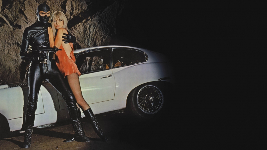
Even more amazing is Danger: Diabolik, a super campy comic book adaptation with some of the most outrageous psychedelic candy-coloured 60’s production design you’ll ever come across. This is the movie that Beastie Boys used as their inspiration for their hilarious Body Movin’ clip. Bava made many more strikingly visual B-movies during his lengthy career but these three movies provide a great starting point and exemplify his outrageous visuals perfectly.