In film, rules are meant to be broken. Color theory is one of the most well-known guides in all of cinema. The general premise that certain colors matched with a specific brightness, saturation, and value will elicit certain emotional reactions from the audience has been followed by many and worked very well. But for more or less as long as color has made its way to the silver screen, directors, production designers, cinematographers, and other minds have found inventive ways to subvert the rules of color theory.
The results can be varied. Subverting preconceived notions of colors can give the film a strong sense of irony, reveal a bastardized aspect of the story’s world, or offer a subtext that is not visible in the characters’ purview. No matter the case, the following 10 films are all examples of how subverting color theory can give additional intricacies to already developed tales.
1. The Thin Red Line (1998)
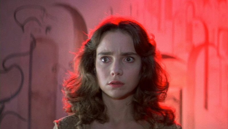
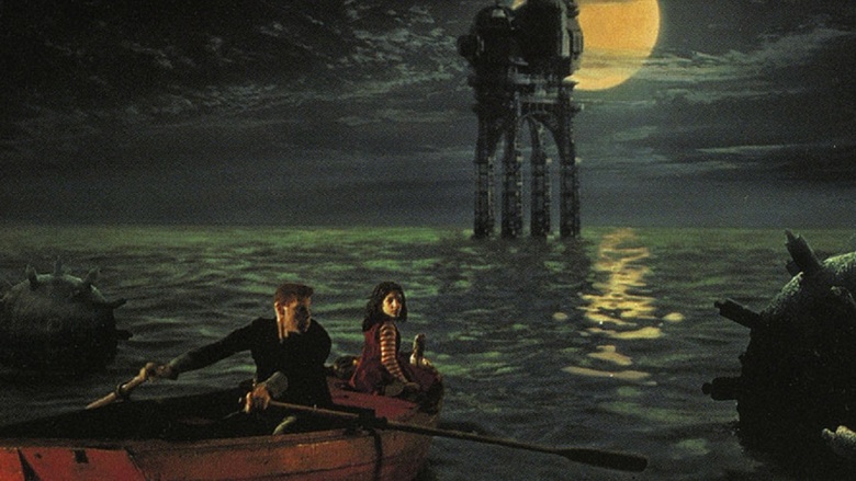
The Thin Red Line breaks a lot of the rules associated with war films, most notably, how they are supposed to look. The look of war on film is commonly merciless, whether that be the unrelenting grays of Saving Private Ryan or the fiery hellscapes of Apocalypse Now or Full Metal Jacket, most war films look the way they should feel.
The Thin Red Line is a notable exception thanks primarily to its use of greens and blues. The idyllic images of greenery, with soft skylight breaking through the treetops is intentionally incompatible with the spirit of war. Green is a color meant mainly to symbolize a connection to nature; blue is meant to symbolize innocence. When war breaks out, the explosions, smoke clouds, and blood never truly consume the screen. Instead, it just inserts itself in the background, not overtaking the rolling hills and clear blue skies but not fading behind them either.
War is not truly able to overtake nature but at the same time is not meant to be there either. The visual dissonance apparent created using the beautiful landscapes untouched by man and the hectic fight scenes reflects the mismatch occurring in the war. War has no place in nature. Its presence there is awkward but at the same time essential to keep it away from areas of crowded populations. Nature is the medium of men to exercise their global conflicts, its beauty one of the primary victims. The naturalistic look lures the viewer into a false sense of security, offering images of peace only to fill them later with ones of destruction. Refusing to use colors associated with war and instead those with nature heightens the bitter dramatic irony of the film and indicate how war ruins what man has not in a way that following color theory simply could not.
2. Phantom Thread (2017)
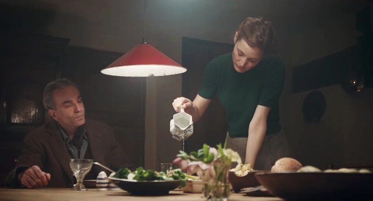
While Phantom Thread is filled with a variety of colors, the House of Woodcock itself is sterilized in white, a seemingly impartial and unfeeling environment that has little to do with the impassioned work that takes place there. At the beginning, white is not much subverted at all. Being a symbol of reverence and protection, it is in perfect alignment with how respectful Woodcock is of his work process, and how sticking committed to it without other engagements has kept his life stable. That stability is maintained, until Alma comes.
When Alma enters the narrative Woodcock initially dresses her in white, representing the degree of professionality he wants to maintain with her. As the movie progresses, Woodcock dresses her in multiple purple dresses, with Alma herself mixing in violet in her own wardrobe. Purple, a long-standing indication of opulence and nobility, is largely incongruent with not just her ethically dubious methods to keep Woodcock loving her, but also with her prior social status.
Alma was a waitress, a foreigner to the grandiose world Woodcock lives in and is now dressed as if she was royalty. It is a color not meant to be bestowed upon her, at least not yet. The fact that it is tells the viewer how Woodcock is abandoning his own standards and giving into Alma’s ways all too quickly. He tries to protect himself by wearing more white clothing. At one point he even has his whole staff wear it while inspecting a dress, but at that moment he collapses from sickness. The breaking of the color code is more than anything a way to say Woodcock has broken his own code, his own work ethic. What once worked, what once protected him, will not work anymore. Dressing and treating Alma as a queen has irreversibly changed his ways. His new life has none of the same structure as before, and now Woodcock cannot resort back to his own world of comfort to be saved.
3. The Social Network (2010)
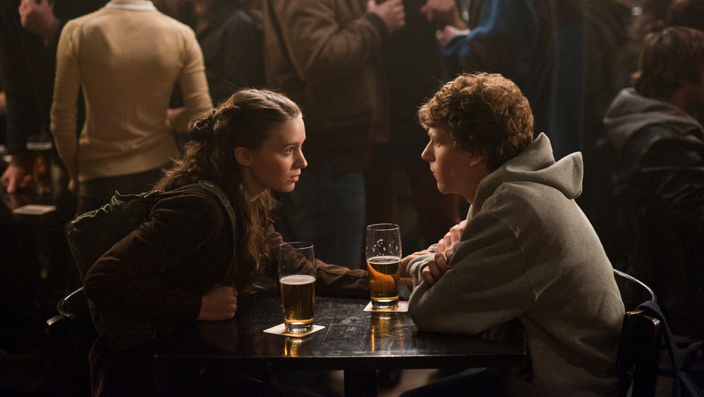
Not every color can look as expressive as beautiful as the rest. Brown is an exceedingly dull color, but that dullness can offer a lot to filmmakers. Brown is meant to look unexciting. Usually employed to express stability, comfort, and a genuine, earthy feel, brown is the working man’s color. It is not meant to seem extravagant and is most likely hinting at some sort of simplicity or regularity of the lives of certain characters.
But filmmakers have also used it in creative, contrarian ways to reveal other truths, such as is in The Social Network. The Social Network is a film practically ruled by brown. From the opening bar scene to the work in Harvard dorms, to the rooms of legal disputes, the film is purposefully standard in its appearance. Because what it really does is take away the glorification of Zuckerberg’s actions. The monotonous color scheme matched with the dullness of most settings robs both the character and the viewer of the transformational nature of the invention of Facebook. Despite how Facebook reached its hand out and changed the lives of millions of people, the road to its inception was not one without blemish.
The brown hue and dimly lit locations work in tandem to showcase just how nefarious some of Zuckerberg’s actions were, and the dark path he had to go through to achieve his goal. Yes, the social media platform transformed the world and was something never seen before but the film’s appearance connotes that the process of making it was filled with the same old greed and hubris that has settled in great minds for generations. The subversion brings down the figures at the top of society, to an unsatisfactory, sour level most people would not see them as occupying.
4. The City of Lost Children (1995)
A common tactic used by filmmakers to make a gripping color scheme is to use the complementary color scheme. The two opposite colors on the color wheel are matched with each other, used in many scenes together and meant to strengthen the other’s inclusion. The red and green color combo holds extra meaning, as it is the one associated with Christmas and the spirit of giving, which is played with carefully in The City of Lost Children.
The City of Lost Children toys a lot with its coloring. It first off, plays with the meanings of the colors themselves, as the two colors of the giving season are seen here in a plot of greed and theft. The world of the film is selfish, a perverse fairy tale that has no room for the vivid joy of the holiday season. This comes even more to the forefront when mentioning the film’s saturation, as it is noticeably lower than the commonly bright lights and fixtures of Christmas. Dialing back saturation goes a long way in defeating the magical quality of the red and green combination, which itself is not even truly fulfilled. Red is included in some capacity in almost every frame but is subdued in so many of them. The triumph of green and the general aura of envy challenges the idea of even the complementary scheme itself. Green messes with the balance of the coloring, a fitting choice for a story packed with unsavory, mischievous villains.
5. A Clockwork Orange (1971)
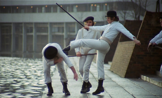
Beyond using the complementary color scheme, filmmakers also have affinities for using certain palettes to indicate a time and set of feelings. The light saturation of pastels dials back the intensity of the look of the film, and is often used in childlike narratives, or at least something to suggest a certain childish innocence. While Wes Anderson may be the most notable director subverting this trend, having raunchy situations and inappropriate characters inhibit the seemingly harmless worlds, Stanley Kubrick did it all the way back in 1971 with A Clockwork Orange.
A Clockwork Orange is decked out with pastel houses, but it is at those houses where Alex and his gang perform their dirty work, where they conduct their most heinous crimes. They are unjust settings for the awful rapes and murders Alex and his friends commit and really emphasize how disturbing the underbelly of England is when one rips off the exterior. Yet, it is not just his crimes where the mismatch of colors stands out. The most awkward scenes in the film take place at Alex’s home. The parole officer’s visit is stirringly unsettling, and like the setting, laced with threats and danger under a deceiving façade.
On the opposite end, the least appealing, bleakest setting in the movie is the facility Alex is sent to. It seems to be the least forgiving location, yet it is the one place trying to do something about the crime in London. Granted, their methods are meant to be seen as cruel, but they are the only concentrated effort to stop all of this. They are the only ones willing to treat the social conditions of the time as a genuine threat and dispense of the pleasantries to find a cure. The contrast is incredibly poignant, not just pointing out issues with the mask of suburbia, but also the morally gray position of the doctors attempting to make sense of troubled criminals.