6. Lost in Translation (2003)
![]()
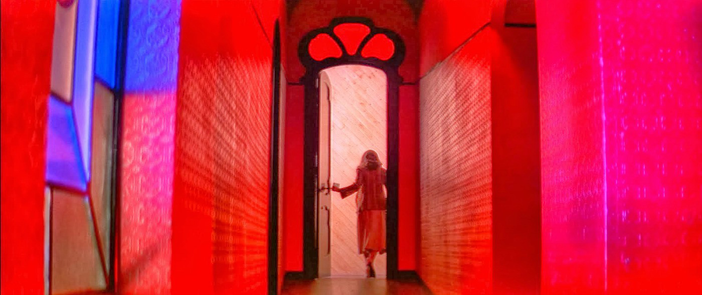
Keeping the saturation light creates pastels but turning it up creates the neon palette. It is a mature, intimidating palette that insinuates anger and violence but also ideas of youth, innovation, and technology. With that being said, one of the most famous uses of neon is in a film that has many ideas and characters that stands against all those associations.
Lost in Translation’s Bob Harris is the epitome of passiveness and a prime example of a man aging past his era. Bob is an old school, aging man who can barely adapt to his own industry, let alone a whole world moving on without him. He is very much out of his own time, which is equally evident in how out of his element he is in the bright lights of Japan, where so many of its youth look to have fun.
The decision to go against what neon is used for is a key aspect that is able to get across the main theme of displacement, not just for Bob but for the relationship he has as well. The melancholic, noticeably calm style of the dialogue and Bob and Charlotte’s feelings are both set against a pointed exterior that does not want to blend them in. Their companionship is not injected with strong attitudes or opinions towards one another, just a light sense of enjoyability and comfort that keeps the other from letting out all their feelings in some burst of emotion. All this passivity and ease in a world of evolution and passion doubles down the film’s message of people being at the wrong place at the wrong time, and still having something wrong about something that feels so right.
7. Suspiria (1977)
One of the hallmark examples of films going against color trends in film has to be the original Suspiria. In the 1970s, horror was very much unwavering in its look. Still shot mainly in black and white, those films that escaped into color were still bleak and bordered in its choice of colors. Suspiria changed the game by going against this general rule of the look of horror and went for something completely different.
Increasing color lightness but decreasing its value, the unique barrage of secondary colors Suspiria calls its own all were foreign to any movie with a monster or killer of any sort. The environment may not look childish, but it also is not quite eerie either. It has a fantastical touch to it that makes the instances of violence all the more sudden and impactful. Like A Clockwork Orange, the color subversion is also meant to reveal a coverup, this time hiding the dark history of its location with unmistakable style. The brilliance and liveliness of the colors pushes away the bloodied tapestry behind the ballet school. Suspiria did a lot of favors for itself; the diversity in colors really assists in a story of hidden truths and horror. But more importantly it was able to prove films can still be terrifying and repulsive without having to look a certain way forever.
8. Corpse Bride (2005)
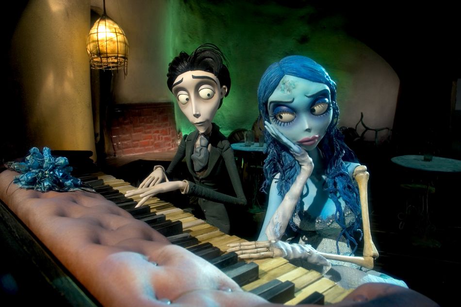
Tim Burton very much has a history of playing with coloring in his film. He adores outcasts and often times has messaging about the deception of appearances and how looks are far from helpful in getting to know the core of people. While Corpse Bride does more than that, it still is certainly the core of Burton’s breaking of color theory in the film.
Corpse Bride is what something like Suspiria should look like. Color lightness is extremely low and not many colors are present, but the heavy use of black and shadow acts as a casing for the animated feature, when, in actuality, there is a deeply sympathetic core to the leads of the movie. The unappealing design is a continuation of Burton’s most evident directorial point, that goodness and kindness does not have to develop where it looks like it should.
But Corpse Bride does more than that. It also decides to use blue as another abundant color in the movie, despite the plot really not showing it belongs there. Blue is a color of commitment and trust, which is totally in conflict with the hurried race of Victor to save his marriage and Victoria’s possible arrangement to Barkis Bittem. Infidelity and indecision are a haunting specter over the leads when stability and faith are historically linked to the color. In a sense, Corpse Bride is a horror film, it is just that the fears are that of marriage. Permanent devotion is not an easy premise for all people, and part of the movie’s mission is to show that is okay. The monochromaticity of Corpse Bride and a dark shell on top both are intelligent swerves that make the audience reconsiders both morality in others and also the potential fears of marriage.
9. Once Upon a Time in America (1984)
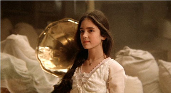
The immaculate look of Once Upon a Time in America has been obsessed over for decades and a significant amount of that has to do with its use of gold and the severe restraint when it comes to color value.
Gold has one of the most transparent color associations out there, hinting at wealth prosperity. It is a color of kings, of success, and of hard work. Yet in Once Upon a Time in America, it cannot show any of those things. The gold tint is a crucial piece of irony in the film, as it hints at something that is not there. The troupe of characters are not living as kings but as paupers, struggling to make ends meet and dealing with intimate struggles of poverty every step of the way. The power of the mafia may be tantamount of kings, but at no point can the characters live under such relaxing, blissful conditions.
Worked into this is the low color value of pretty much every frame in the film. The softness of the colors makes for a poetic feel that shows New York in all its magnificence and glory but yet again is looking to introduce an idea that is not represented in the film. At the end of the day, as much as the mafia life is glorified, it is still an institution that must make use of murder and corruption to survive, and is not nearly as light and endearing as the look of Leone’s masterwork.
10. Three Colors: Blue (1993)
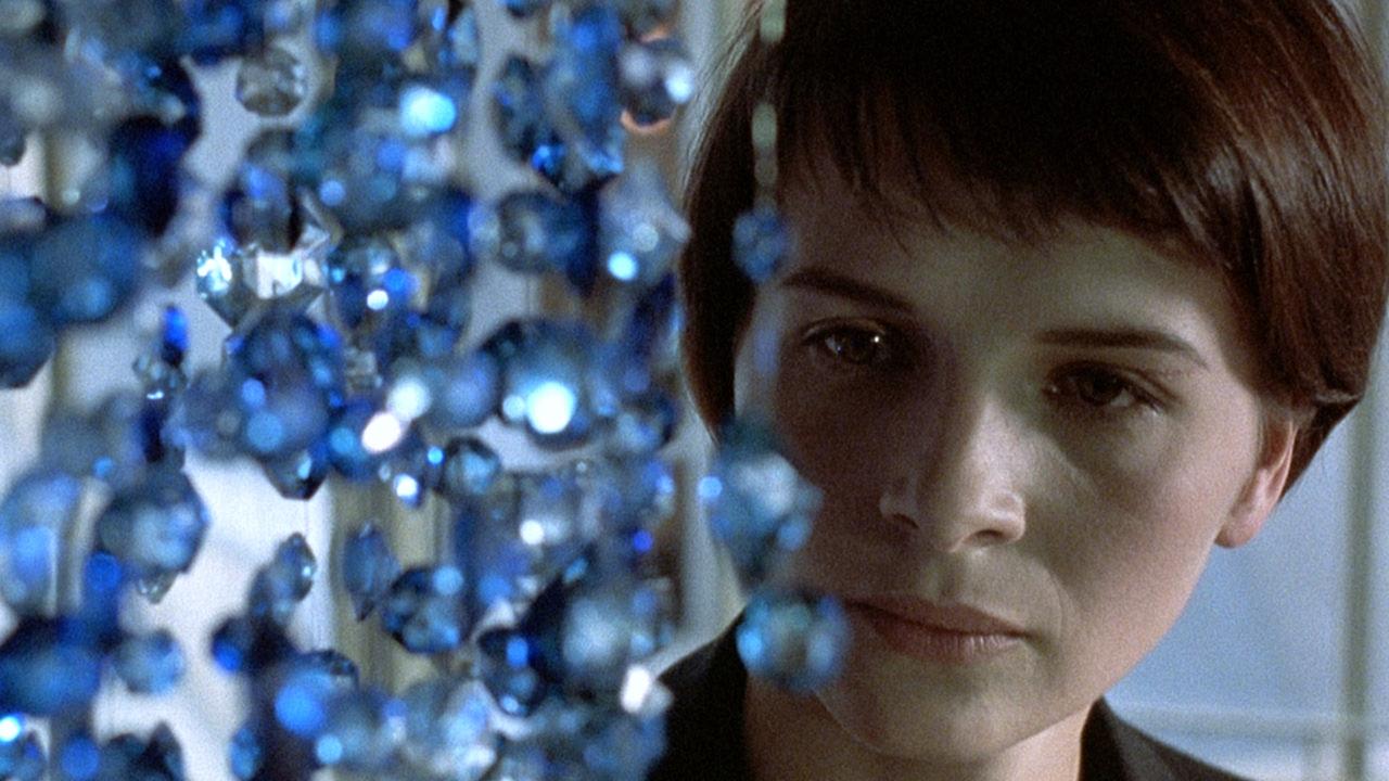
Three Colors: Blue and its sister installments are all exemplary models when it comes to using color, but the first may just do it the best. The colors of the trilogy each are ones on the French flag, with blue dealing with the concept of liberty. But blue grants no such spiritual freedom to Julie. When she visits her old house, lightly dowsed in blue and also containing the blue chandelier, she only becomes more vulnerable to more sorrow. She falls deeper into despair and loneliness and is farther away from the liberty she seeks. When she visits the pool for a swim, she leans on the side, near tears. She nears a breakdown when every place she goes to should provide her liberation under the rules of color theory. In these instances, blue conveys the opposite of what it means on the flag. Julie has become controlled by a grief she wants to scrape off and simply cannot do it with normal ways of dealing with tragedy.
Oddly, it is out of place moments when Julie is able to find peace. The film uses color discordance and the color green when Julie finds moments of joy or relief. Like when she is able to envision the face of her daughter or eat ice cream by herself in the middle of the night. The coping mechanisms meant to let her move on with her life are the very things holding her back. Just as green gives her life as opposed to blue, Julie is able to come to terms with the tragic loss of her immediate family in unsuspecting ways. The message communicated is that grief is strangely specified for every single person and being able to live without severe burden sometimes means finding relief where one does not expect it.