There is no shortage of art that goes into a film. So many aspects of film are their own artform entirely (e.g. music, photography, design). Among the most recognizable and apparent of these artforms is cinematography. Cinematography has the power to send an okay film to stardom. Cinematography also, on some rare occasions, has the ability to merge with the conception of a film, creating a mind-blowing whole that is at once stunning, beautiful, and inspiring. Between the use of color, framing, depth, and overall composition, here are ten films that accomplish just that.
10. Kuroneko (1968)
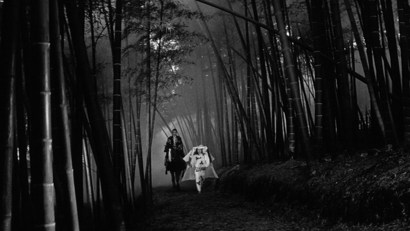
This classic Japanese horror film (Black Cat, in English) has stood as a pillar of ingenuity since it was made in 1968. At its heart, it is a ghost story in which two feudal Japanese women take revenge on the samurai that ravaged and killed them. It is a series of justified executions shrouded in mysticism and trickery.
The accurate portrayal of any ghost-like figure is a feat in itself. But when it is done in 1968 and is as impressive as Kaneto Shindo and Norimichi Igawa made it, it is bound to have a lasting impact. The entire setting of their ghost-like figures is against pale whites and murky grays, blurring the lines between her and her environment.
9. The Grand Budapest Hotel (2014)
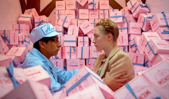
Wes Anderson has long been known for his extreme attention to detail when it comes to his cinematography. Every lamp, book, and utensil are placed with the utmost care, creating a beautifully symmetrical landscape in every frame. Every single one of his films is an immaculate example of this, but the obvious standout is The Grand Budapest Hotel.
Like all of his films, The Grand Budapest Hotel has a certain off kilter quirkiness to it, permeating through the characters, plot, and music. While all the aforementioned elements are present in this film, the particular element that stands out here is the color. Pale pink and baby blue are used everywhere. The paint on the exterior of the building, the boxes of sweets, even some of the characters outfits. The intense brightness of the colors themselves and Robert Yeoman’s consistency and devotion to them throughout the film creates an entire environment for the viewer to get sucked into.
8. Three Colors: Red (1994)
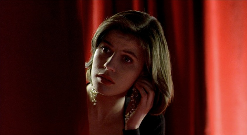
Krzysztof Kieslowski’s stunning Three Colors trilogy (1993-1994) received one of the best and most immediate receptions in recent memory by critics and audiences alike and has since remained a staple of the cinematic experience. Touching on the three tenets of the French Revolution in each film (liberty, equality, and fraternity, respectively), the films independent but loosely tied together narratives create an overall experience that is nothing short of captivating.
While each of these three films would represent the trilogy well with regard to cinematography, Three Colors: Red, the third film, remains neurotically devoted to its aesthetic. The most obvious example of this is how the color red permeates through the film, creating an unmistakable atmosphere. From the iconic bubble gum shot to the absolutely unforgettable finale of the trilogy, this film has rightfully set itself apart among both the trilogy itself and from cinema in general.
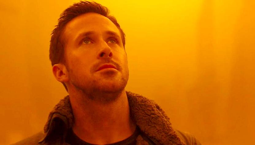
7. Blade Runner 2049 (2017)
With such an iconic and influential first film, a lot of people were hesitant when this film was first announced. It would be near impossible to outdo what Ridley Scott had accomplished in 1982 with Philip Dick’s fascinating story. But along comes Denis Villeneuve, a Canadian director that has only continued to grow in popularity since he came onto the scene with Polytechnique and Incendies. (Denis is also taking on the mammoth work Dune; whose reputation is even more insurmountable than Blade Runner was).
The most memorable thing about this film is the color orange. There is a stunning hue around most everything that happens in this film, particularly in the scenes out in the desert. Every shot was so wonderfully crafted, from Jared Leto’s milky and mysterious eyes to Ana de Armas’ wonderful and breathtaking scene attempting to morph her hologram self with the body of another. The forward motion of time usually does good things for the film industry, and this is particularly evident in the science fiction genre. Villeneuve had more at his disposal than Scott ever did. This is not to say that 2049 is a better or more ingenious film than the original, it is just to say that the visually captivating elements have a lot more going for them in a film made in 2017 vs a film made in 1982.
6. Taste of Cherry (1997)
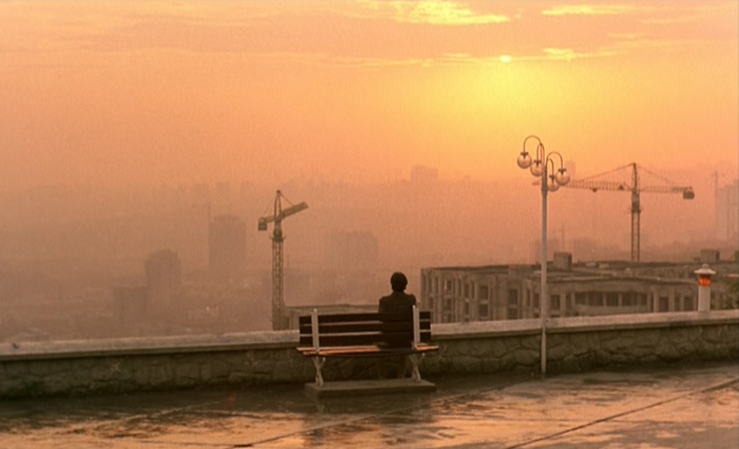
Abbas Kiarostami’s relationship to fact and fiction is quite interesting. He somehow has an incredible distaste for the genre of fiction, while having made some of the most captivating narratives in recent memory. His Taste of Cherry follows a man seeking to end his own life. He feels a religious need to find someone to bury his body upon his death and drives around the city trying to find that person. The ending of this film could only have been pulled off by Kiarostami, who cannot let the viewer believe in an entirely fictional story.
Much like Blade Runner 2049, one of the most striking elements of this film is the color orange. It also takes place mostly in desolate landscapes, with sand constantly getting blown in the wind. In a few particular moments, the sand completely shrouds the main character in a haze, perfectly reflecting the idea of him wanting his own death. He appears as a ghost would, pushing him into the realm of the dead even as a living figure.