Cinematography is one of the strongest aspects of any film. Cinema is both a visual and audible medium, but bright and vibrant colours may grasp your attention long before a sound does. In a complete, aesthetic package, sound and vision will connect and create a sphere of euphoria.
It is rare to find an authentically monochromatic film, where every colour is anchored by a specific colour of choice; not many films only contain objects that are shades of green and only green, for instance.
Yet, these ten films are heavily controlled by a certain colour or shade. I avoided picking black as an option for a few reasons. Shadows and darkness are heavily used regularly, but are also more of a comment on the lighting of a film and not the colour.
Even so, many films utilize black as a central colour to embody many attributes (evil, sickness, fear, the like). I wanted to go a bit further and find films that find comfort within specific colours that make them stand out of their eras. These are ten films that employ a specific colour (or shade) exceptionally well
On a quick note, I am fully aware that black and white are not colours, but rather either the lack of colour (black) or the culmination of all colours in the spectrum (white), and are not specific wavelengths but rather the combination or absence of wavelengths. Enough colour theory, though!
Also be wary of potential spoilers.
1. Black Swan – White
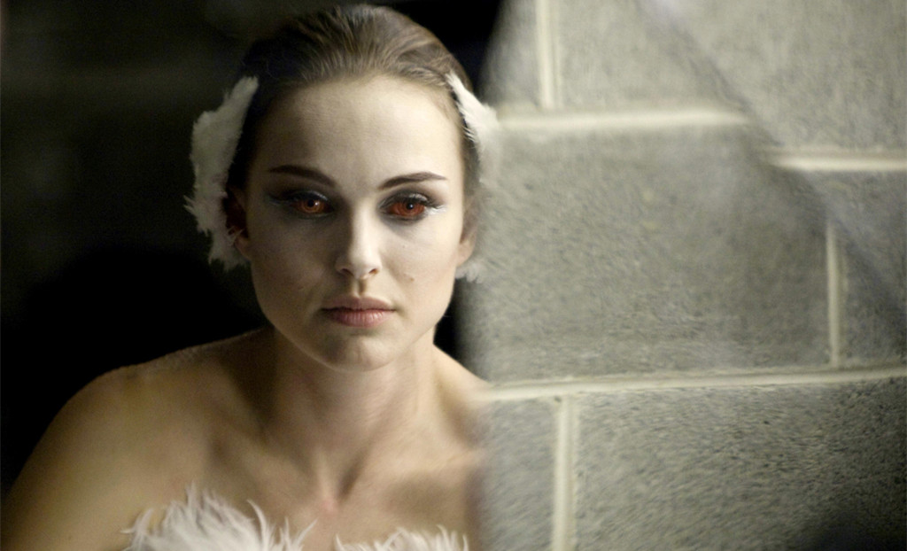
Our first example has a grainy texture throughout, as Black Swan was filmed on 16mm film. The colours and shades do not jump-out at you, as much as they feel textured and tangible. Black and pink are also central colours here (black for Nina’s wild side, and pink for Nina’s developing sexuality), but the colour that sticks out the most is white.
White is the ballet dress the naïve Nina dons while she keeps getting knocked down for being too innocent. She is fragile like glass, and delicate like snow. When Nina changes into her black costume for the titular black swan routine, her white make up sticks out in a ghastly way.
The entire film is a battle between white and black (with touches of pink tossed in). Black is the loudest colour used here, but white always seems to slip through, representing a lingering purity in Nina despite her outbreaks. Red finally stains the white outfit during the climax, and the last dregs of life may be no more.
2. Chungking Express – Green
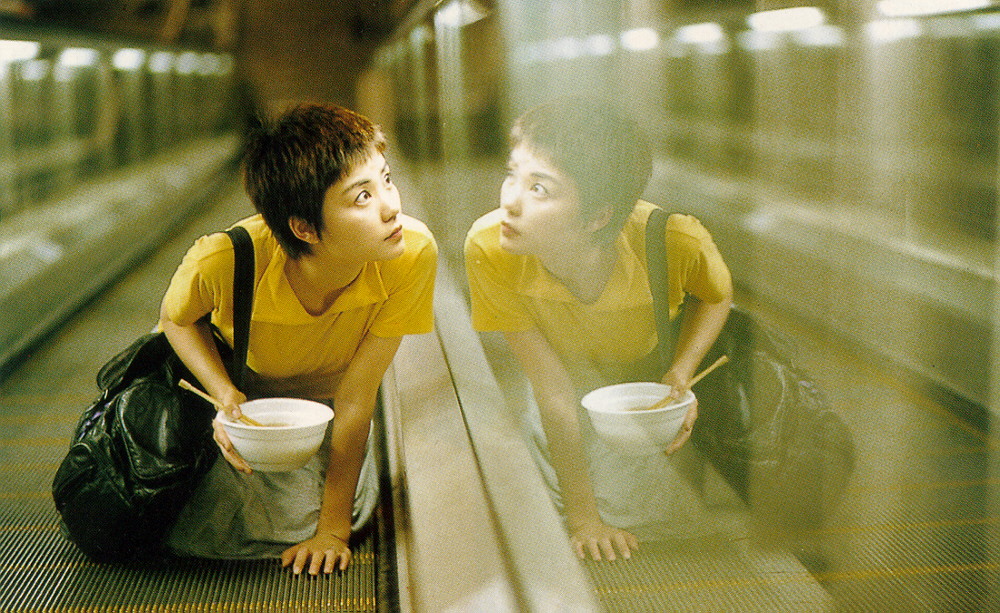
Throughout all of the oddball calamities that take place in the busy Chungking Express, there are many loud colours being tossed your way. One core hue that seems to linger throughout every scene is the cool, lime green that works like a subtext more than a focal point.
While reds, blues and yellows will blur past you, this deep green seeps into almost every shot. In fact, green is used to make these other colours leap out towards you as much as possible. Green could be the growing that these characters require to continue their lives, whether it be the growth needed to move on from a break up or the kind required for gaining enough confidence to talk to your crush.
In the apartment complexes of the lead male characters, green sits upon every object; a prime example is the fish tank where the plant décor overtakes the rest of the aquarium. The green is never obnoxious, but there is enough to make all of Chungking Express feel like a daydream, a music video, or a fleeting memory.
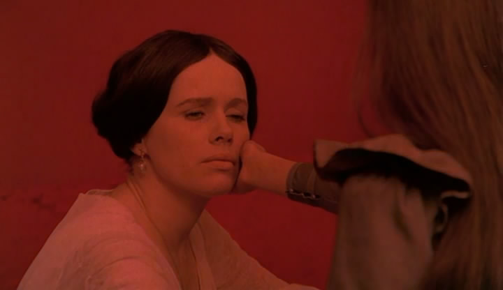
3. Cries and Whispers – Red
One of the most obvious examples of a film that is enriched in its chosen colour schemes is Cries and Whispers. Black, white and red dominate the screen at almost every turn. The focus here is on the deep crimson that seems to bleed into each and every crevice imaginable.
Red is the hatred between sisters that gets in the way of the bigger matters at hand. Red is representative of those larger ordeals, too, as it is the blood that is leaving Agnes’ failing body. Memories fade in and out by cutting to a blank red rather than black or white. Self-inflicted wounds stain the past of Karin.
Blood is a prevalent theme in this film, whether it is bad blood within a family, the efforts to nurse the sick back to life, or the bodily fluid that escapes through our wounds and cracks. Blood represents the necessity for life and the inevitability of death: the two biggest thoughts circulating around the minds of these distraught characters.
4. Enter the Void – Purple
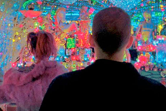
Let’s be honest here. Every colour imaginable is used in this hallucinogenic experience, because every turn is a neon-infested avenue waiting to eat us alive. In Oscar’s trip out experiences, we see every colour that humans can conceivably see (maybe even colours we don’t even know the names of).
The title credits are enough of a trip-out for us. At the end of the day, a series of purples seems to prevail throughout the flurry of various other colours. A lavender works as the basis of the neon colours that sit on top of it. Eminence simmers underneath all of the obnoxious colours on top, and somehow ends up winning because of its lack of fight at all.
With all of the information we are being sent, purple appears to resonate the most despite being the most muted in many instances. The odd occasion has this colour rise to the top: the floor of the strip club is such a rich orchid, for instance. With every other calamity going on, purple is our hand being held as assurance that we can get out of this bad trip okay.
5. The Godfather – Yellow
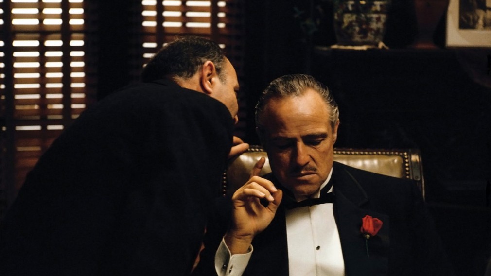
Frankly, all of The Godfather is sepia toned to obviously make the film feel like a visit to an older time. This sepia allows for only one primary colour to take charge when it needs to: yellow. The way sunlight pours in through the half-opened blinds almost feels like a holiness is present with us in Vito’s office. Italy is soaked in the drops of sunlight to the point that you can feel the blistering heat there.
Any form of light reflection is a golden yellow that turns the image into a work of art. Sure, brown hues run underneath it all, representing the ugly underbelly of the mafia life. However, yellow is the life that draws us closer. It is the flames of the candles at the baptism that remind us that danger is afoot under Michael’s control. Yellow shines, but it also indicates heat and pain. The mob life can be full of riches, but death or pain is at any corner waiting for you.