8. The Lord Of The Rings: The Return Of The King
Designer: Grant Major

Where to start with this entry? All installments of the Lord Of The Rings trilogy were conceived as one and involved the help and work of hundreds of artists and professionals.
When talking about the films’ set designs, a lot of it comes down to Alan Lee and John Howe, brought aboard the project for being famed Tolkien illustrators. The two artists worked side by side with Peter Jackson to draw and illustrate the various locations of Middle Earth that take part in the story. After their work was done, Grant Major was tasked with converting their designs into architecture and model building.
Such extensive work paid off, as the LOTR trilogy has exquisite sets throughout. From the white opulence of Minas Tirith to the warm rural tranquility of Hobbiton (built in life-size scale a year before shooting began), passing through the dark stones of the Mines of Moria, every setting in the films feel like an ecosystem on their own.
Jackson wanted the sets to feel grittily realistic and have some degree of historical regard. For that, Lee, Howe and Major took inspiration in many famous sightings around the world, like Mount St Michel, Petra in Jordan and even Japanese Temples. Major was also inspired by the works of Frank Lloyd Wright and William Turner to create the sets.
Furthermore, it’d be unfair not to laud the contribution of Dan Hennah as the trilogy’s chief set decorator. He was, after all, the man responsible for monitoring the construction of the numerous sets and the re-organization of locations to serve as different settings.
7. Cleopatra
Designer: John DeCuir
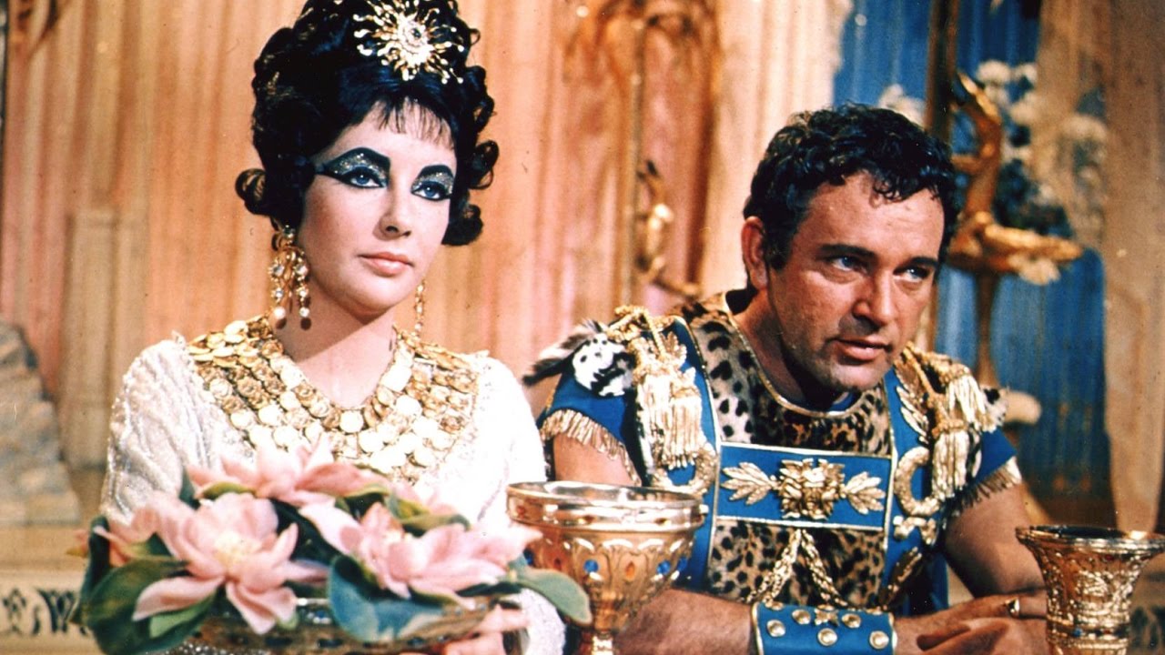
If Cleopatra were to be produced today, it would cost around US$330 million dollars to make. Of course, those expenses were not expected from the get go, as the movie changed crews, scripts, studios and even countries during its lengthy production. And although it was a box-office failure that nearly bankrupted Twentieth Century Fox, it is now widely regarded as a masterclass of production and costume design.
To say that the creation of Cleopatra’s world was a grueling task is a severe understatement. Thousands of artists, artisans and workmen were hired to help the building of the 70+ sets designed by DeCuir.
As most of the props and sceneries were handmade for the film, expenses grew evermore. It also didn’t help that DeCuir was instructed to build the sets three times larger than their historical equivalents, or that his recreation of the Sphinx statue was 35-feet tall and 70-feet long, or that they used real gold to decorate costumes, props and settings.
However, all megalomania aside, Cleopatra’s size and scale is a jaw-dropping undertaking. Glamourous and excessive, it’s a movie whose opulence sparked a new movement in fashion design. It was even considered one of the most influential films in pop culture by none other than Andy Warhol. One look at Cleopatra and you’ll see why.
6. 2001: A Space Odyssey
Designer: Anthony Masters
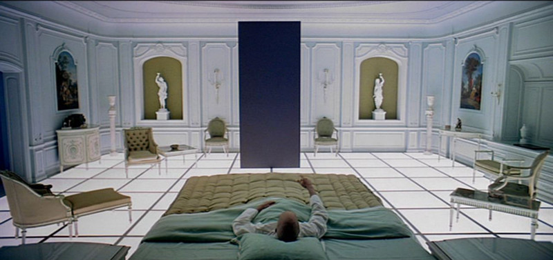
Stanley Kubrick’s 2001 is a work of intense perfectionism and attention to scientific accuracy. Therefore, it comes as no surprise that Kubrick and cowriter Arthur C. Clarke hired Frederick Ordway and Harry Lange, two NASA spacecraft consultants, to design the many ships and capsules that take center stage in the film.
After they had envisioned the technological world of 2001 – and had thoroughly explained every nook and cranny of every location in the script – it was down to production designer Anthony Masters to make their concepts a reality.
And boy, did he knock it out of the park. 2001: A Space Odyssey’s sets are spellbinding. The centrifuge jogging sequence, which demanded the construction of a real spinning set, and the accented red-orange interior of HAL’s mainframe are just two examples of the movie’s entrancing sceneries.
And while both may be scientifically accurate, there is certainly a visual allure to them, an organized symmetry and aesthetical identity. It is not a particularly futuristic vision, it is instead a 1960’s vision of the future – a beautiful sort of retro futurism that, much like in Blade Runner, is not found anymore.
So, of course the rooms of white floors and pink couches or the infamous Stargate sequence take somewhat poetic liberties. But who cares? It is stunning design coupled with a bygone conception of how our future would look like. And that alone sells the film’s sets and overall design.
5. Rear Window
Designer: Joseph Macmillan
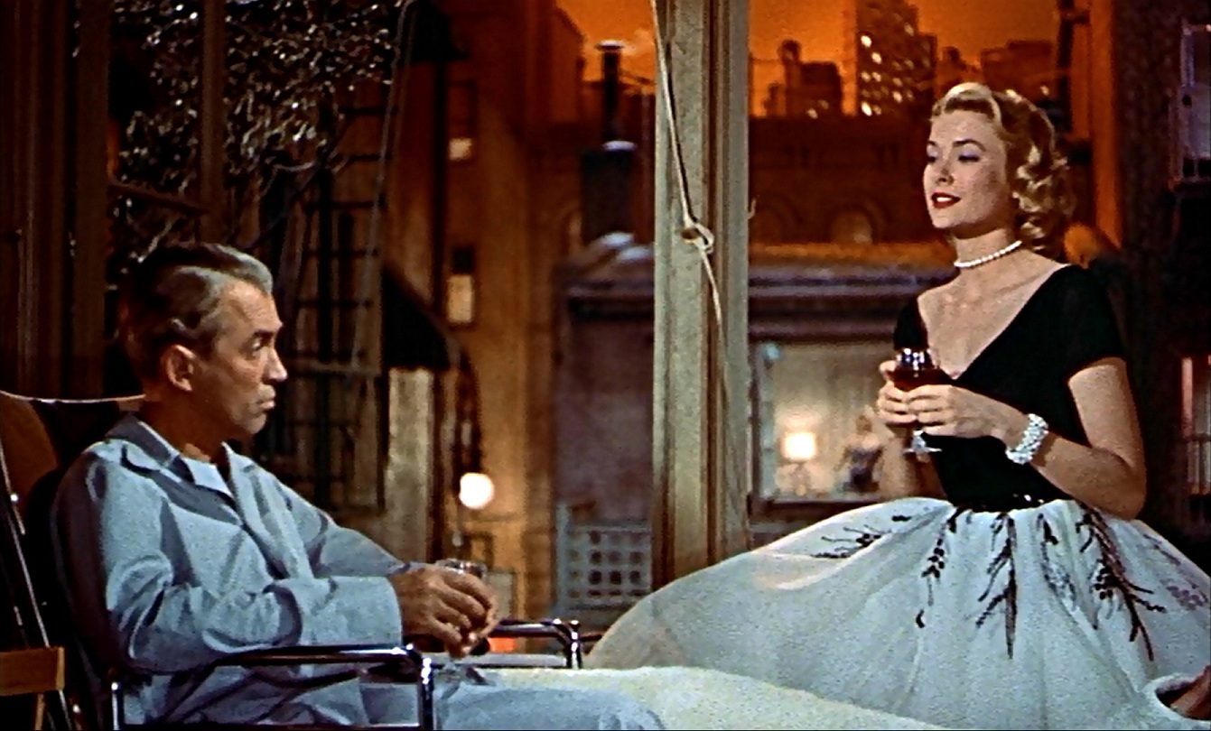
Quick question: can you imagine Rear Window set anywhere else if not in its original location? Quick question number two: can you think of any movie where the set is more integral to the story itself? That’s because Alfred Hitchcock’s Rear Window is not only one of the best suspense films of all time, as it also boasts one of the best set designs of all time.
Rear Window is a movie about voyeurism in which the sexual aspect of the fetish is replaced by the violent, homicidal nature of the plot. The films opens with a gliding camera, panning over the many windows of the set, depicting the social spheres and dynamics that exist therein. When the murder suspicion kicks in, it is up to the set to gradually reveal what indeed happened, and its many curtains and windows begin to unfold the key clues to the mystery.
Production designer Joseph Macmillan worked extensively with Hitchcock (who was known for conceptualizing every element of the film before camera roll) to design the set especially for the camera. It speaks volumes of his capacity to design according to camera angles and movement.
Hitchcock was very adamant as to the production of his films, and he believed every art director should understand architecture. Macmillan’s work and painstaking attention to detail shows Hitchcock had nothing to be worried about.
4. Intolerance
Designers: D.W. Griffith and Walter L. Hall
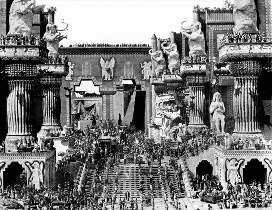
It might seem utterly bizarre that a man most famous for directing a movie that spawned the uprising of the KKK in 1910’s America would produce a 210-minute long epic on the hardships of love and solidarity against intolerance throughout the ages. But those familiar with D.W. Griffith’s career are aware that’s precisely what he did, beyond sparking several innovations in cinema.
Intolerance is definitely one of the biggest, most daring movies ever to be made. An epic told in four storylines set in different periods (Ancient Babylon, Jerusalem at Jesus’ Crucifixion, France at the time of the French Revolution and 1910’s United States), Intolerance is a movie whose sheer size and scale is hard to put unto words.
Griffith had little interest in model making and camera tricks to illustrate the grandeur of Babylon. Instead, he had it built in full scale – a 1000-foot-high, 5300-foot-wide set populated with over 3000 extras. In fact, most people working in the film assumed Griffith was at the helm of four different pictures, given the gargantuan size of the sets.
But it’s not just the size that counts in this instance. Intolerance’s sets are breathtaking to this day. The details carved in the walls of Babylon, the chandeliers swinging at a humongous aristocratic saloon in 18th Century France, the hundreds of extras witnessing Jesus’ demise. It’s a kind of tactile ambition one doesn’t see anymore, a megalomania that defined Old Hollywood and inspired many great filmmakers to think a little bigger (here’s looking at you, Kubrick).
3. The Conformist
Designer: Ferdinando Scarfiotti
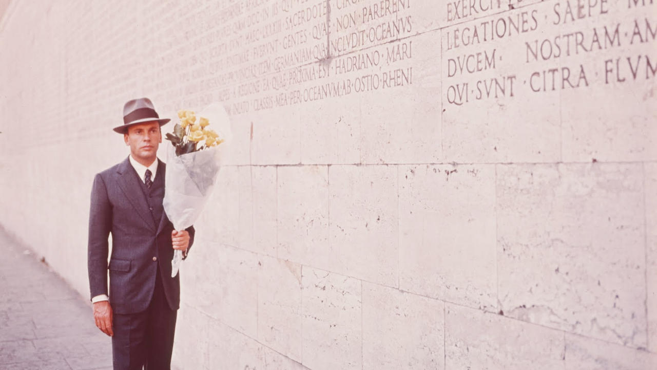
You may not know it but Bernardo Bertolucci’s The Conformist was a major game-changer in terms of set design, mainly because of Scarfiotti’s approach to observing and further designing a given space. While many before him thought of locations as separate entities whose symbols and appearance had to be inserted into the film, Scarfiotti saw them as proper, organic movie sets.
Scarfiotti’s bold, sometimes uncanny, choices are well-known in the reals of set design. When asked about a scene in The Conformist which involved several walnuts on a table, Scarfiotti said “I thought it looked good”. That freedom and unapologetic approach towards set design is what separates The Conformist from the rest.
It’s not only the incorporation of fascist symbolism and architecture into many of the films spellbinding sceneries, it is the freedom to create visual ideas of locations rather than to recreate them in realistic fashion.
Think the mental hospital Marcello visits halfway through the movie. It looks nothing like a mental hospital and yet it is unmistakably a mental hospital, due to the atmosphere it elicits and all symbols and objects present therein, even if organized and designed with poetic license. It is that specific interest in presenting the unrealistic under a visually realistic pretext that made The Conformist’s set design so original and so influential.
2. Alien
Designers: Ron Cobb and H.R. Giger
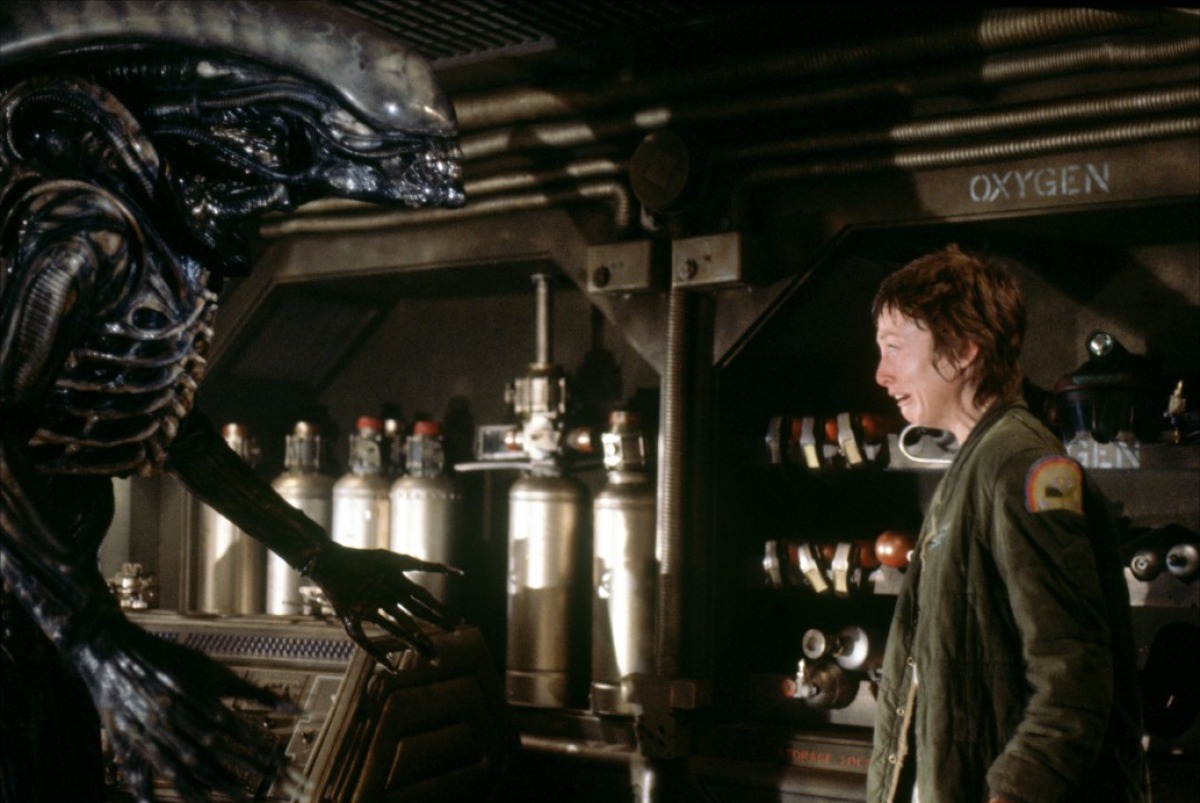
Mistaken are those who believe only H.R. Giger was responsible for Alien’s instantly iconic set designs. Giger was hired to design the alien creature itself and its humid, terrifying habitat. Ron Cobb was the man behind the gothic, labyrinthine and claustrophobic vaults and corridors of the Nostromo. In other words, Giger was the man behind the moster; Cobb, the man behind the humans.
What is apparent throughout on the set designs is how the two collaborate at several turns. The eponymous Alien is a terrifying combination of biological organism and metallic/mechanical design which blends into the spaceship where most of the film is set in.
Meanwhile, the ship itself is a futuristic depiction of a fully functional space travel vehicle. Cobb is said to have approached the project as an industrial design challenge, and set out to make sure everything felt real – in his own words, “right down to the fuel tolerances, the centers of gravity, the way the engines function, radiation shielding (…)”.
Such concomitant artistry (even if leaning towards a more sexually disturbing side) and attention to detail is what ensured Alien’s sets would become the stuff of legend to film lovers worldwide.
It also probably helped the actors to better immerse themselves in their characters, given that, as the medical bay and bridge of the Nostromo were built in real scale, if one actor wanted to leave the set he would have to walk all the way through it. So, they were pretty much trapped in there, just like their poor alien-food characters.
1. Metropolis
Designers: Otto Hunte, Erich Kettelhut and Karl Vollbrecht
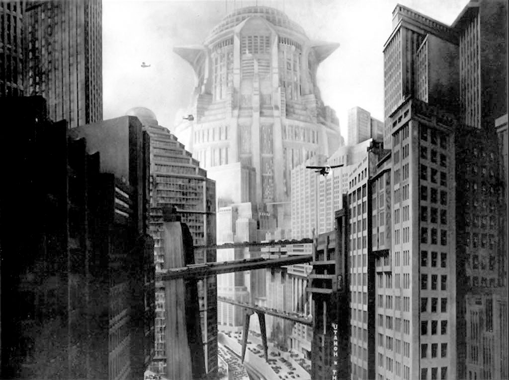
Let’s be reasonable here: there could only have been Metropolis for the number one slot all along (ok, almost a close tie with Blade Runner, but hey, the latter was deeply inspired by the former). Dark, somber and expressionistic, the sets of Fritz Lang’s Metropolis are masterpieces of architecture and design.
Primarily consisting of matte drawings and paintings, flat wooden relief models, and three dimensional models scaled to 1/16th of the simulated heights, Metropolis’ sceneries depict a futuristic dystopia, filled to the brink with oppressive factories where the people seem very small and super modern business offices where the people seem ambitiously big.
Taking inspiration from Bauhaus, Art Déco and, naturally, German Expressionism, every building and set in the film is powerful and frightening, with their focus on verticality amidst the city’s intersected roadways.
It’s hard to think of a sci-fi film that hasn’t been influenced by Lang’s visuals and designs. The dominating New Tower of Babel can be directly seen in Blade Runner and the film’s idea of skyscraper roadways paved the way for many iconic visual elements in sci-fi, spanning from Star Wars to The Fifth Element. All in all, you can’t beat the Germans when it comes to genius design and dawn-of-cinema filmmaking.
Author Bio: Fernando Pompeu is unashamed to admit he loves Batman and Robin. He just tries to hide that information behind a lot of Bergman and Tarkovsky films. He also has a small production company.