5. Nicolas Winding Refn
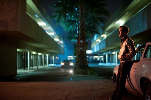
It seems to be quite ironic that Danish director Nicolas Winding Refn is one of cinema’s most capable filmmakers in terms of using color, regarding the fact that he is unable to see midtones. He comments that this has a huge influence on his visual work: “That’s why all my films are very contrasted, if it were anything else I couldn’t see it.”
One just has to see the neo-noir stylized crimes of “Drive”, the dark landscapes of “Valhalla Rising” or the surrealistic illustration of psychopath Charles Bronson in “Bronson” to hail his statement as pure truth. But while his extraordinary use of contrast and color results in highly pleasing and original visuals, it isn’t just a visual thing. All of his movies deal with contrasting themes such as love and hate, aggression and passiveness, perfectly fitting his visual aesthetic.
4. Alejandro Jodorowsky
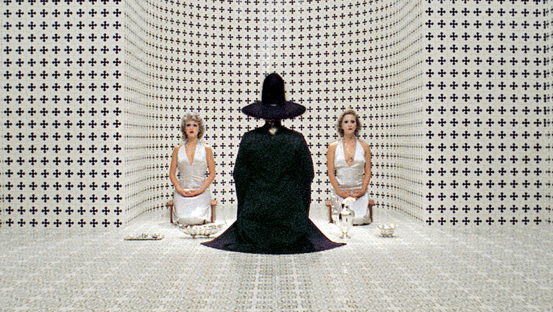
The oeuvre of Chilean filmmaker Alejandro Jodorowsky is a cryptic one full of references to religious, esoteric and surrealistic themes. His tour de force production “The Holy Mountain” might be his most colorful work.
The movie is an immersive journey and can rightly claim to be one of the most esoteric movies of all time. While the narrative’s outside world is dominated by far more raw and realistic colors, the inside of the tower, where the majority of the movie is taking place, is dipped into gaudy shades. The characters changes are represented by them.
One of the greatest shots is when the protagonist is going through a rainbow-like tunnel, changing from shades of red to blue. This could be understood as a status change from mortality to immortality, giving the narrative a much deeper meaning, simply by coloring the set in a distinct way.
3. David Lynch
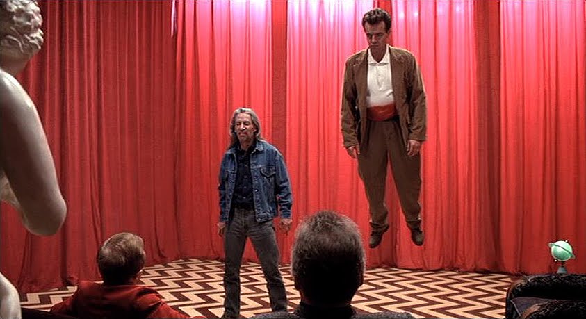
David Lynch creates movies as haunting as their subjects. He thematized the darkest of human abysses with surrealistic thrillers such as “Blue Velvet”, “Lost Highway” or his magnum opus “Mulholland Drive”. His use of color always served the film’s narrative. This doesn’t surprise, bearing in mind the director’s background as an visual artist.
There are tons of great examples regarding Lynch’s use of color. But to minimize it in one, it could be the opening shot of “Blue Velvet”. A fresh-painted white fence with the blue sky behind and red roses in front of it. What looks like a well-selected picture with the simple purpose of looking great has a lot more substance to offer, simply by the selection of its colors.
In the mixture, these colors represent the American flag, implying that the following events work as a metaphor for America on a whole and not just for a personal and insignificant story. All of his films take advantage of color as a storytelling tool. Even his black-and-white debut “Eraserhead” does that. The dark and grainy tones perfectly fit the obscure story and the concrete environment of industrialized America with its brutalistic architecture.
2. Stanley Kubrick
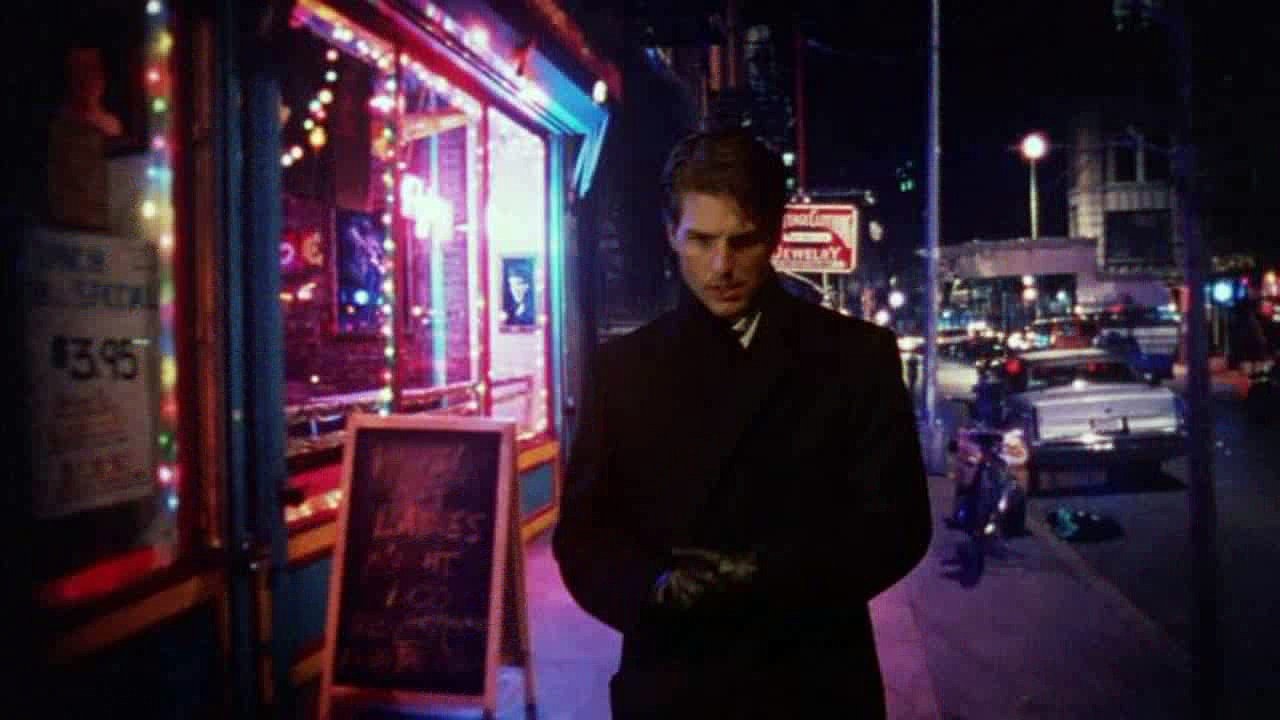
Despite being one of cinemas most original directors of all time, Stanley Kubrick is known for being a perfectionist, controlling every aspect of his movies down to the smallest detail (even the marketing aspects of his movies was controlled by him). He discovered the potential of color after several black-and-white movies, proving his ability with his 1968 science fiction epic “2001: A Space Odyssey”.
In particular, the transcendental space travel sequence in the movie’s last quarter with the surrealistic colored footage is as psychedelic as it is visionary. A lot of today’s famous directors name this sequence as a moment of enlightenment in early states of their careers (Christopher Nolan is just one of them).
Kubrick knew that color has the potential to tell a story on its own and could excel the simple purpose of style. Regarding that, his masterpiece “Eyes Wide Shut” from 1999 deserves a separate mention when it comes to the use of color. Dominated by shades of red and blue, the movie’s story is constantly supported by Kubrick’s metaphorical color palette and gives narrative hints as well as pulling the viewer into the film’s universe.
1. Wes Anderson
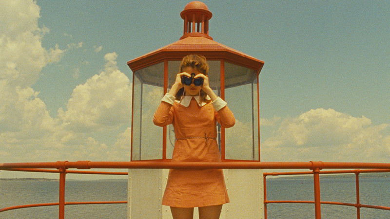
The oeuvre of Wes Anderson offers one of the most immediately recognizable styles in contemporary cinema. His use of symmetry, stunning sets and a recurring acting ensemble including big names like Bill Murray, Owen Wilson and Jason Schwartzman are the keystones to his very own aesthetic. But the feature that might stand out the most is his exceptional use of color. All of his 12 movies – both full length and short films – propagate his trademark look. They work as a masterful blend of nostalgia and modern fairy tale, monochromatic perfectionism inside a magic universe.
Anderson knows how to give life to the scenery or his characters simply by using color. In his 2014 success “The Grand Budapest Hotel” the use of muted pink lets the hotel itself become a character. In his early work “The Royal Tenenbaums” from 2001, Margot Tenenbaum (embodied by Gwyneth Paltrow) is constantly associated with shades of yellow. These are just two examples of Anderson’s intelligent use of color. It’s both visually pleasing and highly functional, making him a master of his craft.
Author Bio: Berlin-based Luc Hinrichsen has a bachelor’s degree in audio engineering and plenty of experience in scoring movies on his own, while working for a film distribution company. Besides that, he’s an aspiring screenwriter and director always curious about enlarging his knowledge about film and its history.