Wes Anderson is not just a filmmaker; he is also continually heralded as an interior designer. He has even designed his own café in Italy, bringing the linear, geometric patterns and pastel colours from the mise-en-scene of the majority of his films into the real world.
Anderson’s set design is, in many ways, another character in his films which pulsates with the moods and feelings of his characters. With so many beautiful instances of Anderson’s careful set design, it is a mighty task to choose the best examples of his work. There are however certain sets which are deserving of particular attention for their beauty and ingenuity.
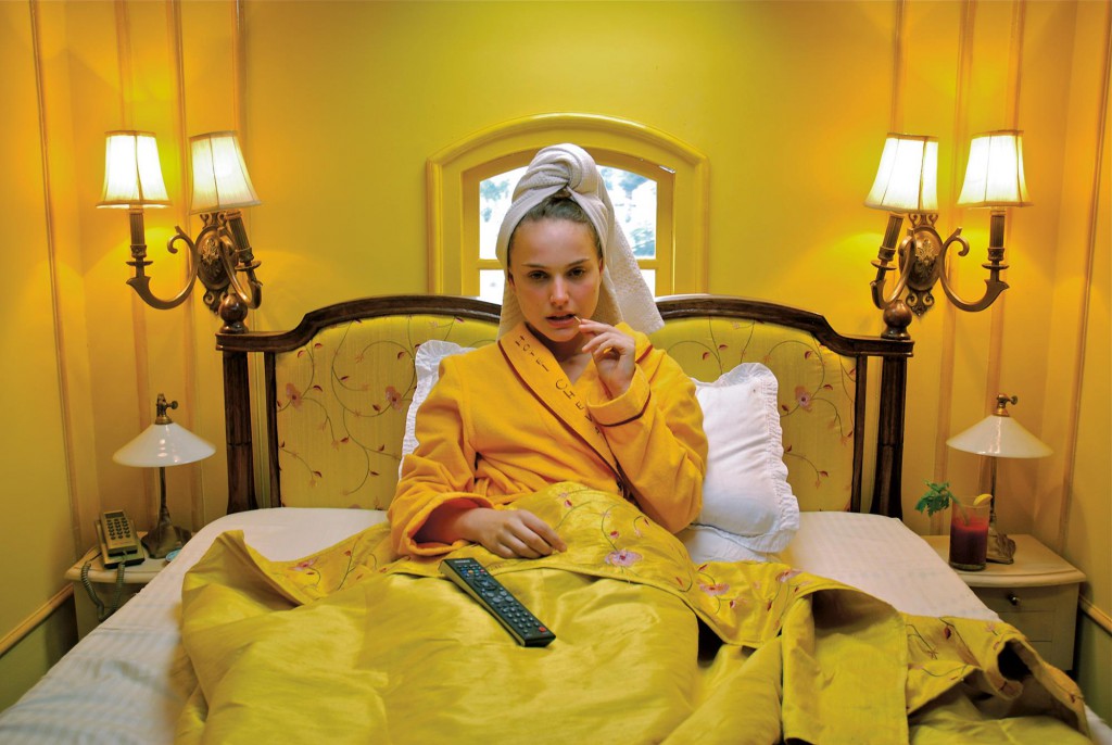
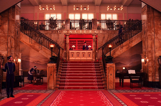
10. The Grand Budapest Hotel – Grand Budapest Hotel
Wes Anderson’s latest feature film plays on many of the tropes and stylistic continuities he has established over his whole career. One of the most noticeable of these is the way his sets are broken down and compartmentalised, using many different spaces to have an influence on the way characters are formed and the film’s tone is expressed.
The Grand Budapest hotel is made up of such spaces. From the baths to the concierge desk, the sets are designed down to the most minute of details. Perhaps the greatest example of Anderson’s interest in minutiae is seen in the model of the hotel Anderson uses for many exterior and establishing shots.
By making the set obviously a model, he is playing into the theme of childhood play which continually arises with his films. It harks back to the stop-motion of Fantastic Mr. Fox and acts as a signifier of his love of small, highly detailed spaces. It is beautiful and iconic and highlights a running trend in the cinema of Wes Anderson.
9. The Train– The Darjeeling Limited
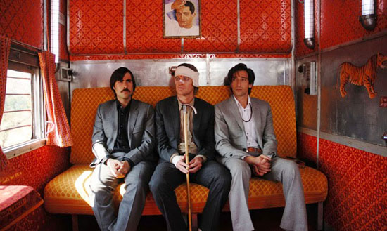
The space of the train in The Darjeeling Limited is one of Anderson’s most carefully designed. It noteworthy as a great piece of set design from Wes for it is a strange mélange of Western and Indian culture, but is still unmistakably from the mind of Wes Anderson.
For example, the patterns of the wall paper adorning the walls of much of the space of the train is a made up of carefully created diamonds. This is often juxtaposed with the brothers’ personalized luggage which is very much of the Western world; a luxury item bespeaking their wealth.
The interior of the train is also claustrophobic for the brothers; it is purposefully too narrow in many areas, forcing the brothers to spend time together when they would really rather be doing anything but that. In this way, the train is almost a character in its own right, necessitating the boy’s interaction with each other.
8. The Classroom – Rushmore
Rushmore tells the story of a boy caught on the cusp between boyhood and manhood. In light of this, it is no wonder that many critics have drawn parallels between Rushmore and Salinger’s The Catcher in the Rye.
In relation to this theme of childhood vs. adulthood, it is interesting to consider how Anderson frequently places Max Fischer in relation to the school and, more importantly, the classroom. Max is a child who is constantly trying to exert a sense of adult maturity.
It is thus ironic that Anderson often places him in a classroom and school setting adorned with children’s drawings and other childish paraphernalia, infantilising Max. Placed in this context, Anderson comments upon the childish nature of Max’s desire to grow up fast, demonstrating how Anderson frequently uses set design to comment on the psychology of his characters.
7. The Campsite – Moonrise Kingdom

The campsite and tents of Moonrise Kingdom play an important role in progressing Anderson’s theme of childhood innocence. The tents are carefully designed, and fill the mise-en-scene with rich golds and yellows, making the campsite a place of edenic bliss. A place away from adult interference.
Furthermore, the way the tents are often imaged lined up in a row shows Anderson’s meticulous attention to detail and his love of linearity. This is an interesting stylistic choice, for it imposes a sense of the ordering of time and space in a place where the freedoms and joys of childhood are played out.
Overall, this is an important piece of set-design, for it marks a peak in Anderson’s career; a moment in which he was fully realising the style we have become accustomed to today.
6. The Restaurant – Castello Cavalcantti

Anderson’s brilliant short film Castello Cavalcanti tells the story of a racing car driver who crashes in small Italian village. The space of the restaurant in the village is perhaps one of the most overtly ‘Wes Anderson’ pieces of set design. The vibrant, harsh yellows and reds contrast with the turquoise of the tables and counter.
The colours are so vivid that they give the space of the restaurant an otherworldly feel. This is important within the narrative, for Castello Cavalcantti is essentially an alien in the bucolic world he crashes in to. The space contrasts heavily with the rest of the town which, shot at night, is made up of a colour palette of dark navys, browns and blacks.
This is a great piece of set design from Wes for it shows his interest in using colour as a signifier, a stylistic trope seen throughout all of his work.