6. THX 1138 (1971)
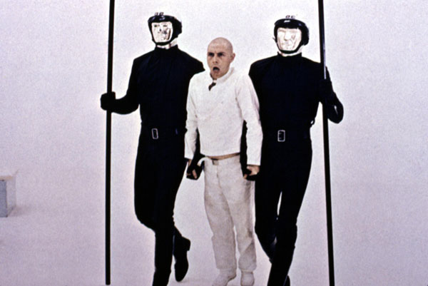
THX1138 uses unusual production design to great effect. Sets are normally used to help bring characters to life. How a character is able to interact with his or her surroundings is often key to our understanding of that person. George Lucas denies us this luxury in his less famous science fiction classic.
While incarcerated in a prison with a white background, the bodies of SEN 5241 (Donald Pleasence) and THX 1138 (Robert Duvall) seem to fade away into nothingness. Almost everything is lost except for the characters’ faces (and with shaved heads, they all look pretty similar). The production design strips away the identity from the characters, by making it hard for the audience to differentiate between them.
7. The Spy Who Loved Me (1977)
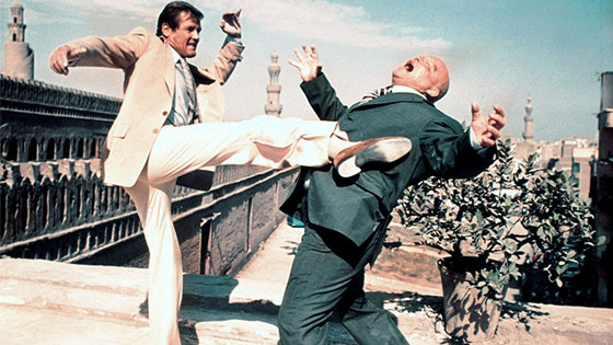
Production Designers often have to discuss production requirements with their ambitious directors. Sometimes, budgets can be a real limiter on what can be achieved but when money is no object new ground can be broken.
Designer Ken Adams warned producer Cubby Broccoli that there wasn’t a set big enough for some of The Spy Who Loved Me’s massive set pieces, so Broccoli replied, “then build it” – and Pinewood’s 007 stage was born. The set proved to be so big that Stanley Kubrick had to be drafted in to help advise the production team on how best to light it.
James Bond is always shown to be cool with cosmopolitan production design (Bond literally travels from country to country) that incorporates the latest gadgets and fashion trends. Beyond this, everything about the visuals in The Spy Who Loved Me says larger than life. Big set pieces, big sets, and big bad guys. This is a classic eye-popping blockbuster, with a licence to thrill.
8. Batman (1989)
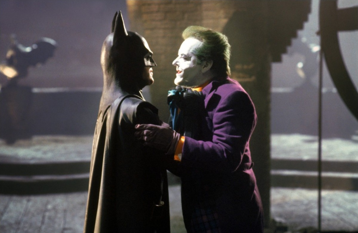
Batman was created in 1939, and has constantly been redeveloped and re-imagined for new audiences over the decades. Wanting to acknowledge this rich history, Tim Burton’s classic Batman has been made difficult to date. The cars are contemporary, but everyone is wearing a hat as if the year was nineteen forty. This timeless feel is accentuated by the comic-book cityscapes and clashing architectural styles.
The film is a great example of how the art direction can subtly help an audience accept seeing larger than life characters (who are both dressed like madmen). Production designer Anton Furst pulled comic book motifs into the background by using highly stylized sets to help the audience accept the need for a vigilante caped crusader. The streets of Gotham City are obviously dark, ugly and it’s therefore implied that the city isn’t safe for its citizens.
9. Twelve Monkeys (1995)
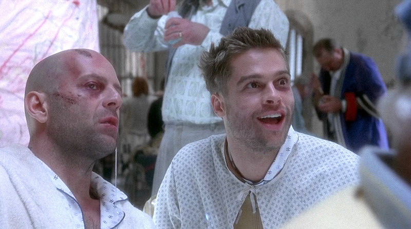
Sadly, a lot of nuances in production design can be lost if a film isn’t seen at the cinema. Intricate details are often hard to spot on smaller screens. For example, at first glance the technology seen in the 2035 scenes in Twelve Monkeys looks futuristic. On closer inspection, you’ll notice that everything has been cobbled together from pre-1996 (the year before the disaster) technology.
Art departments often have a lot of fun decorating sets, visiting flea markets and car boot sales, picking up unusual objects that can really add texture to the mise en scene. Also, in Twelve Monkey’s everything looks worn out and dirty. Sets are often made to look dirty or as this adds a sense of time and wear to a film.
James Cole (Bruce Willis) is depicted as mentally unwell, and the cluttered sets really heighten his confusion. As well as this, to emphasize Cole’s feelings of paranoia the production design uses a lot of CCTV cameras and television sets. Cole is literally being watched.
10. The Royal Tenenbaums (2001)
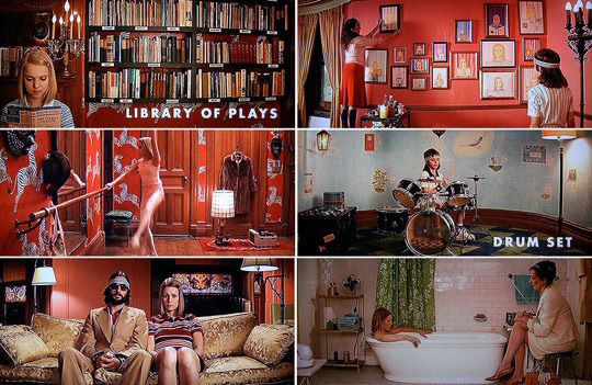
If you’re wondering just how far you can go with stylizing a set, look no further than Wes Anderson’s The Royal Tenenbaums. Each shot looks more like a painting than it does reality (character’s costumes even coordinate with the backgrounds that they’re standing in front of). The colour palette is also controlled quite strictly – the sets and costumes use autumnal colours; reds, browns and oranges as well as a striking pale blue.
The reasons why the family fell apart are subtly implied by the production design. Anderson wanted different rooms within the Tenebaum house to specifically match the characters that would live in those rooms. As the Tenebaum family is so large, and as each family member is so different, it becomes obvious (through the set design) that there’s not only a clash of decor styles that don’t fit together – there’s also a fundamental clash of personalities.
Author Bio: David Biggins is a film graduate and marketeer from England. He’s been published on the BBC website, and used to present a film radio show in Norfolk. Before joining Taste of Cinema he was a film critic for Reel Whispers.You can follow David on Twitter @MrMilktray.